0 members and 7,877 guests
No Members online

» Site Navigation

» Stats

Members: 35,443
Threads: 103,072
Posts: 826,684
Top Poster: cc.RadillacVIII (7,429)
|
-
 Sig/Wallpaper Mixture Sig/Wallpaper Mixture


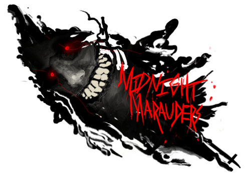
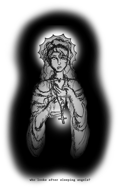
CnC is very much appreciated. These designs are for someone's album cover.
I'm not used to working with just text as the main focus, but I'm working on it.
Please give your favorite between the two, Thanks in advance! 
(View Image for the exact dimensions, I think it looks better that way...)
Last edited by goliathfell; 03-01-2010 at 05:42 PM.
Reason: Extra info
-

this needs to be moved into Digital Art.
as for the Covers, they are a bit over contrasting for my taste. aslo a bit to sharpened.
gw kiu
-

 Originally Posted by Kritez

this needs to be moved into Digital Art.
as for the Covers, they are a bit over contrasting for my taste. aslo a bit to sharpened.
gw kiu
I'll make sure to post stuff like this in the Digital Art subboard from now on...
The text itself is too sharpened? Or the background is too sharpened?
Thanks kritez for the critique 
-

hmmm, i think its more of the bg really, but the text may be aswell.
np 
-

Agreed with Kritez, also i think the dubble name in the top-one makes it meh. I'd keep the yellow one, but would use blue instead off yellow.
From scratch, just smudging the XL way
-

 Originally Posted by Xelo

Agreed with Kritez, also i think the dubble name in the top-one makes it meh. I'd keep the yellow one, but would use blue instead off yellow.
Oh, thats a good idea, I was told that the artist doesn't really like blue, but who cares, I'll try that out. I'll get rid of the red text. Thanks for the critque Xelo.
-

yeah man the bg is over contrasted by alot texts is ok in the 1st but i dont like the 2nd text that much keep workin man
-

 Originally Posted by UnDeRoAtH

yeah man the bg is over contrasted by alot texts is ok in the 1st but i dont like the 2nd text that much keep workin man
Thanks for the encouragement underoath! I'll make sure to not over sharpen from now on, that should also help with the overcontrasting I think. I might also tone it down a bit with the bg. Thanks for your input oath.
-

the sharpness has nothing to do with the overcontrasting man the contrast is to do with the colors
-

... well i can tell you now that this isnt an album cover (sorry D
from what i've learned from doing hand-drawn artwork for people's album covers, the size is about 14.2x12.4 centimeters, with a .7-1cm binding. and then another 14.2x12.4cm square for the back cover. it'll look like this:
----------|--|----------
|back.....|..|....front..|
|cover....|..|...cover...|
----------|--|----------
the space in the middle is sposed to be the edge (just demonstrating cause when i did my first album cover i drew the whole thing... backwards... and a little piece of me died on the inside when i realized that
leave about 1-2 cm's on all edges for cropping
when doing these in photoshop, do it in RGB color (best for printing really) and set @ 300ppi
remember when you're making these, people are either going to be viewing them on a printed piece of paper in a CD cover, or as an icon version in itunes or something like that. make them accordingly. (for instance, certain colors have a weird effect on the comp [could b my eyes] but they wont have that effect on paper)
album covers are usually the first introduction to the type of music you'll be listening to, and thus they should accurately represent the music. metal bands usually have skulls and dead peoples on their album covers, while miley cyrus has hot pink butterflies and ponies flying across a rainbow with music notes in the air (...jk.... but you get my point) @ first glance, your art looks nothing like an album cover. whats the album name, for instance? @ 2nd glance i'd guess that maybe this was an album cover for techno music, idk tho.
dont forget that when designing an album cover you're also doing the back, such as the song names and a boarder design along with the typography.
hope i helped ^.^
Similar Threads
-
By Vaporizer in forum Digital Art
Replies: 7
Last Post: 08-08-2008, 08:01 AM
-
By DrksYd665 in forum Digital Art
Replies: 4
Last Post: 01-17-2006, 10:41 AM
-
By Sumomo in forum Sigs & Manips
Replies: 4
Last Post: 12-29-2005, 03:15 PM
-
By `Kakashi in forum Resources
Replies: 0
Last Post: 12-18-2005, 04:53 PM
-
By robz in forum Digital Art
Replies: 3
Last Post: 06-14-2005, 01:52 PM
 Posting Permissions
- You may not post new threads
- You may not post replies
- You may not post attachments
- You may not edit your posts
-
Forum Rules
|


 Reply With Quote


