GFXVoid Graphic Design Forum

Remove Text Formatting
Loading...

» Online Users: 5,946

0 members and 5,946 guests
No Members online

» Site Navigation

 > FAQ

» Stats

Members: 35,443
Threads: 103,072
Posts: 826,684
Top Poster: cc.RadillacVIII (7,429)
Welcome to our newest member, Lekelindids
Results 1 to 10 of 10

Thread: Beaterator

  1. #1
    Join Date
    Sep 2009
    Location
    New Jersey
    Posts
    4,752

    Default Beaterator

    Cnc!


  2. #2
    Join Date
    Sep 2009
    Location
    New Jersey
    Posts
    4,752

    Default

    Cmon Guys!
    *dustball rolls by*


  3. #3
    Join Date
    Sep 2008
    Location
    Currently Melbourne Australia
    Posts
    222

    Default

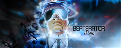
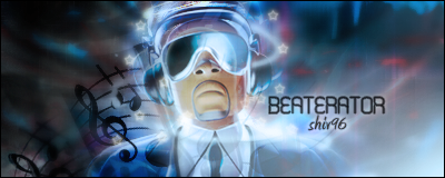
    I like it, it just needs some more contrast.

  4. #4
    Join Date
    Sep 2009
    Location
    New Jersey
    Posts
    4,752

    Default

    Anyone else?


  5. #5
    Join Date
    Mar 2005
    Location
    Georgia,USA
    Posts
    4,752

    Default

    dont bump your own topic so quick man lol

    its alright i like the midnight feel to it the misty feel it has i hate the text

    i dont like the music notes that much and the starts keep workin man


  6. #6
    Join Date
    Mar 2010
    Location
    OMG i forgot
    Posts
    183

    Default

    The text is eww! But the idea is nice.

    Should put more contrast cause it looks too blury!
    iQ*

    Never forget you are special. Just like everyone else<3

    .................................................. ..................................


    Gifts:

  7. #7
    Join Date
    Sep 2009
    Location
    New Jersey
    Posts
    4,752

    Default

    Thanks Guys !
    Ill make a V2 i think


  8. #8
    Join Date
    Sep 2009
    Location
    New Jersey
    Posts
    4,752

    Default

    Cant Edit my post....wtf!!!

    Heres v2 more contrast and burned it a bit


  9. #9
    Join Date
    Sep 2009
    Location
    New Jersey
    Posts
    4,752

    Default

    Plz pllz plz!!!!!!!!!!!!!!!!!!!!!!!!!!!!!!!!
    Everone hates me


  10. #10
    Join Date
    Jan 2010
    Posts
    2,599

    Default

    not liking the font shiv...

    the notes and the star doesn't go well too..

    keep working at it

    heheh
    I dont make sigs anymore

Similar Threads

  1. Beaterator
    By schultz in forum Sigs & Manips
    Replies: 10
    Last Post: 02-05-2010, 08:33 PM

Posting Permissions

  • You may not post new threads
  • You may not post replies
  • You may not post attachments
  • You may not edit your posts
  •  
Powered by vBadvanced CMPS v4.1.1