GFXVoid Graphic Design Forum

Remove Text Formatting
Loading...

» Online Users: 5,831

0 members and 5,831 guests
No Members online

» Site Navigation

 > FAQ

» Stats

Members: 35,443
Threads: 103,072
Posts: 826,684
Top Poster: cc.RadillacVIII (7,429)
Welcome to our newest member, Lekelindids
Page 1 of 2 12 LastLast
Results 1 to 10 of 13
  1. #1

    Default M-M-M-Mooortal Kombattt


    You Like? You should :<>

  2. #2
    Join Date
    Jan 2010
    Posts
    403

    Default

    Do not want. D: The colors make for an interesting composition, but the render looks awfully cut and pasted.


  3. #3

    Default

    wasnt, I got it like that

  4. #4

    Default

    pretty lq of a render

  5. #5
    Join Date
    Jan 2010
    Location
    Guatemala
    Posts
    1,084

    Default

    i think he means that its not blended in anyway in the sig... that u just paste it in there
    Favorite and Most Recent:


  6. #6
    Join Date
    Sep 2009
    Location
    Candy Mountain
    Posts
    832

    Default

    whoa... wayyyyyyyyyyy too busy... uhh... and idk how rainbows and ninjas go together... maybe its just me not seeing the.... similarites or something but... yeah... uhh... yeah...

  7. #7

    Default

    ^ that was real funny, post some serious cnc please

  8. #8
    Join Date
    Sep 2009
    Location
    United States
    Posts
    695

    Default

    The render doesnt fit at all.. in fact it kinda makes me mad just looking at it.. until i see the burst of colors then it smooths my emotions
    [Enter Signature Here]
    Gifts: [x][x][x]


  9. #9
    Join Date
    Jan 2010
    Location
    Guatemala
    Posts
    1,084

    Default

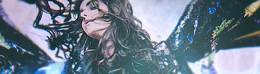
    hey really... all of the CnC are right... the colors really dont match at all and the render looks really just pasted in there nothing to do at all... idk wat were u trying but okay...
    Favorite and Most Recent:


  10. #10
    Join Date
    Dec 2006
    Posts
    5,223

    Default

    the style of the sig your using now is realy nice but this one your showing is well like they said looks like u put 0 effort into it and just messe with colors and gradiant andslaped in a horriably cutt render try a blue bg and some shine ness of a white brush and use brush tool to smudge it it in to get the better effects in the sig gl man keep it up


Posting Permissions

  • You may not post new threads
  • You may not post replies
  • You may not post attachments
  • You may not edit your posts
  •  
Powered by vBadvanced CMPS v4.1.1