0 members and 497 guests
No Members online

» Site Navigation

» Stats
Members: 35,443
Threads: 103,072
Posts: 826,684
Top Poster: cc.RadillacVIII (7,429)
|
-
-

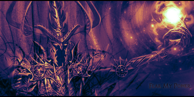
Hmm, it's alright, not the best though. Your lighting is off, well, I assume that you made the ball of light yourself; if not, then the stock or render has two different light sources which is tricky to work with. The blending is okay, the black lines kind of make the whole thing look messy though. And the text could be done better, though, I'm pretty bad at text myself, so yeah. Other than that, it's good. You could probably tone down the monotone too, but yeah. Not trying to be harsh if it seemed like it, just trying to give some suggestions and point out a few things. Hope I helped.
-
-
 Originally Posted by furbz

Hmm, it's alright, not the best though. Your lighting is off, well, I assume that you made the ball of light yourself; if not, then the stock or render has two different light sources which is tricky to work with. The blending is okay, the black lines kind of make the whole thing look messy though. And the text could be done better, though, I'm pretty bad at text myself, so yeah. Other than that, it's good. You could probably tone down the monotone too, but yeah. Not trying to be harsh if it seemed like it, just trying to give some suggestions and point out a few things. Hope I helped.
This. Over-contrasted IMO.
Originally Posted by Slave
takken, you sweet boy you, i could eat you 6^
-
^^^agreed.
Btw Chonfat I like it; but im kinda interested in seeing it w/o the gradient

My Three Rules Of Making a Sig Flow, Lighting and Depth
Similar Threads
-
By Bubi in forum Sigs & Manips
Replies: 4
Last Post: 09-24-2009, 12:13 AM
-
By zole in forum Sigs & Manips
Replies: 5
Last Post: 10-07-2008, 04:06 PM
-
By VoodooGypsy in forum Sigs & Manips
Replies: 5
Last Post: 04-02-2007, 01:23 PM
-
By Arkanian in forum Sigs & Manips
Replies: 6
Last Post: 01-19-2007, 05:55 PM
-
By Chemical in forum Sigs & Manips
Replies: 12
Last Post: 06-08-2005, 09:46 PM
 Posting Permissions
- You may not post new threads
- You may not post replies
- You may not post attachments
- You may not edit your posts
-
Forum Rules
|


CnC please


 Reply With Quote