GFXVoid Graphic Design Forum

Remove Text Formatting
Loading...

» Online Users: 4,788

0 members and 4,788 guests
No Members online

» Site Navigation

 > FAQ

» Stats

Members: 35,443
Threads: 103,072
Posts: 826,684
Top Poster: cc.RadillacVIII (7,429)
Welcome to our newest member, Lekelindids
Results 1 to 5 of 5

Thread: Similar Style

  1. #1

    Default Similar Style


  2. #2

    Default


  3. #3
    Join Date
    Jul 2009
    Location
    Brooklyn, New York
    Posts
    1,604

    Default

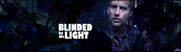
    You should try a clipping mask on the text so that it doesnt pop out too much. And there is way to much unused space to the left.

    My Three Rules Of Making a Sig Flow, Lighting and Depth


  4. #4
    Join Date
    Mar 2010
    Posts
    170

    Default

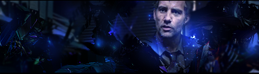
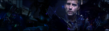
    too much negative space
    and render dosent really blend in

  5. #5
    Join Date
    Oct 2009
    Location
    The Netherlands
    Posts
    2,776

    Default

    hmmm this has potential. the first two version were way to dark. your third with the extra blue light is much better, but still to many black c4d's. sometimes less is more.

Similar Threads

  1. Similar Words
    By FatalFury in forum The Void
    Replies: 122
    Last Post: 09-03-2007, 04:41 PM
  2. Replies: 1
    Last Post: 08-19-2006, 02:22 PM
  3. New style
    By Tweak in forum Sigs & Manips
    Replies: 4
    Last Post: 02-02-2006, 06:52 AM
  4. New Style -=- CnC Please
    By Mr.Black in forum Digital Art
    Replies: 2
    Last Post: 01-25-2006, 06:53 AM
  5. kinda similar to one before
    By Adam in forum Sigs & Manips
    Replies: 4
    Last Post: 11-20-2005, 02:24 AM

Posting Permissions

  • You may not post new threads
  • You may not post replies
  • You may not post attachments
  • You may not edit your posts
  •  
Powered by vBadvanced CMPS v4.1.1