0 members and 4,165 guests
No Members online

» Site Navigation

» Stats
Members: 35,443
Threads: 103,072
Posts: 826,684
Top Poster: cc.RadillacVIII (7,429)
|
-
-
-

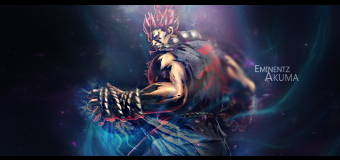
The first one is cool, I like the comic style color scheme. However I'm not feeling the smudging. But hey I'm not very good at it either lol. Also I don't like the black sorta inner shadow border thing. Get a nice border on there, look up a smudge tut and post up V2!
:Why be sour when you can have power?:
-
-
Nice i like the comic feel to it!
THe Color version is awesome!
Good Work Man!
-
@darkgumz - Yeahh I know v2 looks weird, just thought i'd post it to see what people think
@PowerKraut! - I'm not too great with smudging lol
@lolindir - Yeahh I'm not good with flow, hehe
@shiv96 - Thank You!
@Everybody - Thanks for the feedback, V2 was just to see what people think, it doesn't really show off any of my work so I knew it wouldn't get as good feedback. Thanks.
A Gift from Liquid, Thanks Buddy!

________________________________________
-
Wack & Blight - Fhat the Wuck!!
From scratch, just smudging the XL way
-
V2 is pretty horibble i think,but V1 have too some mistakes in colors ,but is better 
Similar Threads
-
By cs4pro in forum Sigs & Manips
Replies: 5
Last Post: 02-24-2010, 08:57 AM
-
By SparryGfx in forum Sigs & Manips
Replies: 10
Last Post: 09-20-2009, 08:22 PM
-
By LoganGFX in forum Sigs & Manips
Replies: 4
Last Post: 03-29-2007, 08:18 PM
-
By Kahno1 in forum Digital Art
Replies: 5
Last Post: 08-19-2005, 08:33 AM
-
By Death of a Clown in forum Digital Art
Replies: 3
Last Post: 07-29-2005, 11:19 PM
 Posting Permissions
- You may not post new threads
- You may not post replies
- You may not post attachments
- You may not edit your posts
-
Forum Rules
|


 Reply With Quote


 - - - - - .:Newest:.


 THX
THX