GFXVoid Graphic Design Forum

Remove Text Formatting
Loading...

» Online Users: 5,809

0 members and 5,809 guests
No Members online

» Site Navigation

 > FAQ

» Stats

Members: 35,443
Threads: 103,072
Posts: 826,684
Top Poster: cc.RadillacVIII (7,429)
Welcome to our newest member, Lekelindids
Results 1 to 7 of 7

Thread: new sig

  1. #1

    Default new sig


    well im new at this so tell me what you guys think

  2. #2
    Join Date
    May 2009
    Location
    Somewhere in space, wandering around the black holes
    Posts
    116

    Default

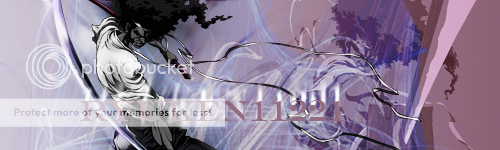
    ahmm, I think there's no definite flow
    the text is kinda large,
    and the canvass is too wide for your render
    _ _ ________________________________________ _ _
    Wrath ▼ Pride ▼ Envy ▼ Lust ▼ Greed ▼ Sloth ▼ Gluttony ►

    Give a man a fish and he will eat for a day;
    teach a man to fish and he will eat for a lifetime;
    give a man a religion and he will die praying for a fish

  3. #3

    Default

    thanks well im new to the whole scene and im still learning im not photoshop friendly as of yet i want to check out some of the tuts on here is there any in particular that are good for me at this level that im at if anyone can i would really appreciate it

  4. #4
    Join Date
    Apr 2010
    Location
    M'boro, TN
    Posts
    226

    Default

    The text stands out too much.

    But on the other hand I love the contrast between the character and the colors used in the background. Nice work.


    They must find it difficult... Those who have taken authority as the truth, rather than truth as the authority.

  5. #5
    Join Date
    Jan 2010
    Posts
    1,013

    Default

    ok some tips:

    the text is too big and distracting. you have two renders of afro samurai which make it hard to distinguish what the focal is. when working with two renders, usually you would lower the opacity which it seems like you did but by putting them next to each other it makes it look like you intentianly made two focal points. also you're effects are pretty random which develops no flow. you should also try adding effects in front of the render instead of just working on a background. On the other hand, for a beginner this is decent. it shows a variety of things that other beginners dont have. good job keep working at it

  6. #6
    Join Date
    Oct 2009
    Location
    The Netherlands
    Posts
    2,776

    Default

    crop 1/4 off the right, get a nice cloudy BG blur parts for depth, get rid off text.... done

  7. #7
    Join Date
    Sep 2009
    Location
    New Jersey
    Posts
    4,752

    Default

    Agreed with JIC and Xelo 100%


Posting Permissions

  • You may not post new threads
  • You may not post replies
  • You may not post attachments
  • You may not edit your posts
  •  
Powered by vBadvanced CMPS v4.1.1