Looks really nice! Maybe a tad too much contrast though, but having the contrast has a nice feel so I'm not sure if it would help. Also, just a thought (since I'm not good by any means) but the bright effects and such on the sides might take some attention away from the focal, but as I said it looks nice anyways. Really like the background.
You still have the same flaw on most of your sigs, the colors need more control make use of the hue/saturation option it'll help a lot. Also, I would erase some sharpness from the effects and background. If you didn't however add any sharpening to the effects or background then just add a blurred layer and erase the focal.
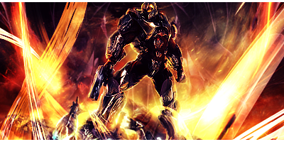
Looks really nice! Maybe a tad too much contrast though, but having the contrast has a nice feel so I'm not sure if it would help. Also, just a thought (since I'm not good by any means) but the bright effects and such on the sides might take some attention away from the focal, but as I said it looks nice anyways. Really like the background.
eh thx ill fix it for v2
Originally Posted by Kotora
You still have the same flaw on most of your sigs, the colors need more control make use of the hue/saturation option it'll help a lot. Also, I would erase some sharpness from the effects and background. If you didn't however add any sharpening to the effects or background then just add a blurred layer and erase the focal.
kk kotora... u know any good tut to show u well how to use hue/saturation option? and thx for the CnC
Originally Posted by Xelo
agree with Kot!! your focal is dark and the effects are bright! guess what drew my attention?


 Reply With Quote


