GFXVoid Graphic Design Forum

Remove Text Formatting
Loading...

» Online Users: 1,811

0 members and 1,811 guests
No Members online

» Site Navigation

 > FAQ

» Stats

Members: 35,443
Threads: 103,072
Posts: 826,684
Top Poster: cc.RadillacVIII (7,429)
Welcome to our newest member, Lekelindids
Results 1 to 6 of 6

Thread: FMA

  1. #1
    Join Date
    Aug 2009
    Location
    The Netherlands,
    Posts
    1,029

    Default FMA

    text sucks.


    CnC please


    Dare the Devil

    www.artistic8.com
    -Domino-

  2. #2
    Join Date
    May 2007
    Location
    Brisbane, Australia
    Posts
    729

    Default

    nice sig dude, yeah lose the text .. other than that great job

  3. #3
    Join Date
    Mar 2005
    Location
    Georgia,USA
    Posts
    4,752

    Default

    tbh i dont like anything on it this is one of your worse imo keep workin man i know your better than that


  4. #4
    Join Date
    Apr 2010
    Posts
    558

    Default

    Quote Originally Posted by UnDeRoAtH View Post
    tbh i dont like anything on it this is one of your worse imo keep workin man i know your better than that
    i know its cnc but are u baked? XD nah idk bout this one kiu!

  5. #5
    Join Date
    Aug 2009
    Location
    The Netherlands,
    Posts
    1,029

    Default

    Quote Originally Posted by FatalFury View Post
    nice sig dude, yeah lose the text .. other than that great job
    Quote Originally Posted by UnDeRoAtH View Post
    tbh i dont like anything on it this is one of your worse imo keep workin man i know your better than that


    This makes me dizzy.


    Dare the Devil

    www.artistic8.com
    -Domino-

  6. #6
    Join Date
    Sep 2008
    Location
    Australia
    Posts
    2,310

    Default

    Quote Originally Posted by Applejuice View Post
    text sucks.


    CnC please
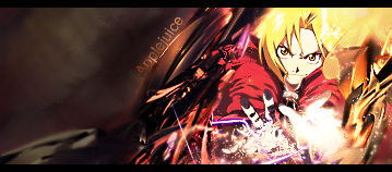
    I'd play around with the Saturation and brightness a bit. It's very rich in the colour and it seems to be drawing a bit too much attention.

    I'd move the text and perhaps have it running across like normal, but in the top half of the left hand side. If positioned correctly, you could create a really nice flow.

    Also seems a lil sharp, but if you soften the colours a bit, that'll probably fix itself.

Posting Permissions

  • You may not post new threads
  • You may not post replies
  • You may not post attachments
  • You may not edit your posts
  •  
Powered by vBadvanced CMPS v4.1.1