GFXVoid Graphic Design Forum

Remove Text Formatting
Loading...

» Online Users: 251

0 members and 251 guests
No Members online

» Site Navigation

 > FAQ

» Stats

Members: 35,443
Threads: 103,072
Posts: 826,684
Top Poster: cc.RadillacVIII (7,429)
Welcome to our newest member, Lekelindids
Results 1 to 8 of 8

Thread: Pan

  1. #1
    Join Date
    May 2009
    Location
    Reichstag
    Posts
    345

    Default Pan


  2. #2
    Join Date
    Feb 2009
    Location
    Manchester/Liverpool, UK
    Posts
    255

    Default

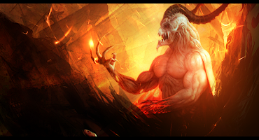
    Looks pretty good don, you've got the lighting spot on. Couples of things to improve on; the darker effects are slightly transparent which takes away some of the depth, also the colour scheme is great but I'm a fan of putting alot of colour into my sigs.

    but yeah, great work.

  3. #3
    Join Date
    May 2007
    Location
    Brisbane, Australia
    Posts
    729

    Default

    wow i really like this one !! nice work ! where's the stock from ?

  4. #4
    Join Date
    Oct 2008
    Location
    Slovakia
    Posts
    1,128

    Default

    very nice color, good effects, depth is ok, but maybe more sharp on render will make it better
    but I dont like his hand on the bottom, looks overcontrasted

  5. #5
    Join Date
    May 2010
    Posts
    35

    Default

    i love this signature
    you get great work.

  6. #6
    Join Date
    Jan 2010
    Location
    Guatemala
    Posts
    1,084

    Default

    ur stuff is always awsome man..... KIU!
    Favorite and Most Recent:


  7. #7
    Join Date
    May 2009
    Location
    Reichstag
    Posts
    345

    Default

    Heh thanx for your replies guys!

  8. #8
    Join Date
    Mar 2010
    Posts
    170

    Default

    this is good dude
    it just seems a bit empty too me
    theres room for sum effects

Posting Permissions

  • You may not post new threads
  • You may not post replies
  • You may not post attachments
  • You may not edit your posts
  •  
Powered by vBadvanced CMPS v4.1.1