


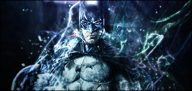
whaddaya think? its made for a darker forum, so it might look bad here..
V1
V2
take a look at it in a darker forum too:
http://ntsd.open-board.com/signature...ile-t19372.htm
|
|


Loading...
|
» Online Users: 3,309
|
Results 1 to 10 of 19
Thread: TO THE BATMOBILE!
Similar Threads
|


 Reply With Quote


