GFXVoid Graphic Design Forum

Remove Text Formatting
Loading...

» Online Users: 280

0 members and 280 guests
No Members online

» Site Navigation

 > FAQ

» Stats

Members: 35,443
Threads: 103,072
Posts: 826,684
Top Poster: cc.RadillacVIII (7,429)
Welcome to our newest member, Lekelindids
Results 1 to 3 of 3

Thread: Pain Vert tag

  1. #1
    Join Date
    Mar 2005
    Location
    Georgia,USA
    Posts
    4,752

    Default Pain Vert tag

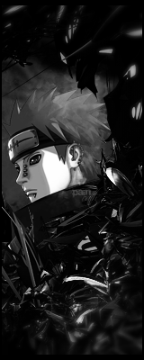
    i was bored so i made this randomly lol


  2. #2
    Join Date
    May 2009
    Location
    Que?
    Posts
    2,460

    Default

    Nice use of the blur but its a bit inconsistent in some areas. To add even more to the contrast, create stronger lighting. Buts its a cool sig man I would remove the text though. Whats the sense in putting something there you can barely see? lol. I would only keep them for the sotw

    Quote Originally Posted by Slave
    takken, you sweet boy you, i could eat you 6^

  3. #3
    Join Date
    Mar 2005
    Location
    Georgia,USA
    Posts
    4,752

    Default

    i always put text even if it sucks but thanks and yeah i know what you mean about the blur thats what i get for using a 200px eraser


Similar Threads

  1. Pain!
    By Suddu in forum Digital Art
    Replies: 5
    Last Post: 04-30-2009, 01:07 AM
  2. This is pain =]
    By dave9339 in forum Sigs & Manips
    Replies: 2
    Last Post: 04-08-2009, 12:15 PM
  3. Pain
    By BonesMa in forum Sigs & Manips
    Replies: 4
    Last Post: 09-23-2008, 11:45 PM
  4. pain
    By imported_starcraft in forum Digital Art
    Replies: 5
    Last Post: 09-21-2005, 03:48 AM
  5. Pain
    By -Kanji- in forum Sigs & Manips
    Replies: 10
    Last Post: 03-19-2005, 03:27 PM

Posting Permissions

  • You may not post new threads
  • You may not post replies
  • You may not post attachments
  • You may not edit your posts
  •  
Powered by vBadvanced CMPS v4.1.1