0 members and 340 guests
No Members online

» Site Navigation

» Stats
Members: 35,443
Threads: 103,072
Posts: 826,684
Top Poster: cc.RadillacVIII (7,429)
|
-
-

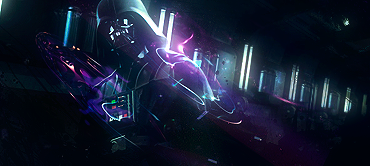
This has potential, you've done well with the lighting and all that, but the text takes away from that, I tend to stay away from putting text on the render. Also, you could probably just crop the bottom of the sig because its practically black space.
-
 Originally Posted by kaka11kaka11

This has potential, you've done well with the lighting and all that, but the text takes away from that, I tend to stay away from putting text on the render. Also, you could probably just crop the bottom of the sig because its practically black space.
Put your text little closer to focals head.
I am a big fan of SW i like it it's a bit empty but the lighting is epic 
awesome job keep it up.
-
I think had you lessened the contrast in this and may be did a bit of blur to the right nice depth could have been achieved but it still has a nice perception of feel though. IThe placement of the render is spot on and the text is nice however the effects near the shoulder seems a bi confusing. I really don't know what is going on there and I find it to be a bit distracting. Also standard border pleased.
Originally Posted by Slave
takken, you sweet boy you, i could eat you 6^
-
Your signatures never cease to impress me, i just love your style!
-
Thanx for your cnc people, heres a v2
-
-
i like this one ! cool effects around his shoulder.. nice and simple 
-
-
v1 is better just make the text smaller. kiu!
Similar Threads
-
By Dron in forum Sigs & Manips
Replies: 0
Last Post: 03-13-2010, 05:29 PM
-
By elixile in forum Sigs & Manips
Replies: 4
Last Post: 07-27-2008, 08:05 PM
-
By Xoligy in forum Sigs & Manips
Replies: 3
Last Post: 05-10-2005, 06:08 PM
 Posting Permissions
- You may not post new threads
- You may not post replies
- You may not post attachments
- You may not edit your posts
-
Forum Rules
|


 Reply With Quote