0 members and 7,558 guests
No Members online

» Site Navigation

» Stats
Members: 35,443
Threads: 103,072
Posts: 826,684
Top Poster: cc.RadillacVIII (7,429)
|
-
 Infamous Infamous
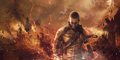
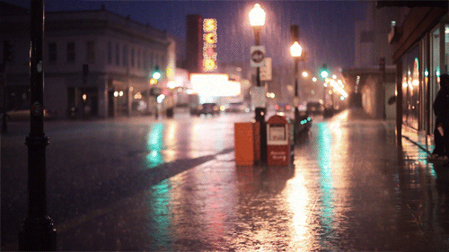
V2:
What i changed:
Blurred background
toned done effects
tried to fix lighting but failed
added lightning to the right side
made it darker around the outside of Sig
took out text
added some filters to darken it a bit
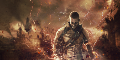
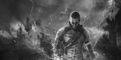
also B&W version:
Last edited by marioman77; 06-18-2010 at 06:48 PM.
-
lacks depth flow and the text remove it
Favorite:

-
i love the idea and alot of the outcome, maybe blur the building a little in the background and some other parts to add depth and un-sharpen other parts, imo the text suits the tag, just move it closer to the bottom of the tag and remove those blue dots at the bottom of the render, also maybe add some more lighting to the left of the render as on the render its very strong but on the tag it isnt 
Overall good job, i like it, if you make some changes i could love it 
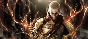
I made a tag with this render, here was my outcome, i prefer yours haha
-
Like they said, create depth using blurring and sharpening. Blur the background, it's drawing focus away from the render. Also, look at your render and look at where the light parts are, that will tell you where the natural light is, use that for lighting.
-
thanks for the feedback guys I'm gonna fix it up later
@ Zole i like how you added the lightning on the right side too.
-
 Originally Posted by marioman77

thanks for the feedback guys I'm gonna fix it up later
@ Zole i like how you added the lightning on the right side too.
Goood and thanks man was a while back that tag haha
-
-
I like the texture you have created in the tag witht he spllater. It loks good. However the composition is messy a bit. Also watch the colors when you do some tiny splatters at the bottom. Keep at it!
Originally Posted by Slave
takken, you sweet boy you, i could eat you 6^
Similar Threads
-
By schultz in forum Sigs & Manips
Replies: 1
Last Post: 02-28-2010, 04:21 AM
-
By Chidori. in forum Sigs & Manips
Replies: 13
Last Post: 06-16-2009, 12:54 AM
-
By DanielGFX in forum Sigs & Manips
Replies: 3
Last Post: 06-06-2009, 01:45 PM
-
By cC.ShorterGFX in forum Sigs & Manips
Replies: 3
Last Post: 06-01-2009, 09:59 AM
 Posting Permissions
- You may not post new threads
- You may not post replies
- You may not post attachments
- You may not edit your posts
-
Forum Rules
|


 Reply With Quote