GFXVoid Graphic Design Forum

Remove Text Formatting
Loading...

» Online Users: 2,493

0 members and 2,493 guests
No Members online

» Site Navigation

 > FAQ

» Stats

Members: 35,443
Threads: 103,072
Posts: 826,684
Top Poster: cc.RadillacVIII (7,429)
Welcome to our newest member, Lekelindids
Results 1 to 4 of 4
  1. #1
    Join Date
    Mar 2010
    Posts
    612

    Default Old Idea, New Tag

    Old:


    New:

  2. #2
    Join Date
    Sep 2009
    Location
    United States
    Posts
    695

    Default

    light source seems a lil weak & blending needs some touching up.
    But defiantly better than the last
    [Enter Signature Here]
    Gifts: [x][x][x]


  3. #3
    Join Date
    May 2009
    Location
    Que?
    Posts
    2,460

    Default

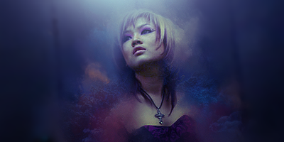
    Needs more lighting so it can contribute to the overall contrast. Too dim results in little contrast if you are working with the colors as they are and aren't making any attempt to clash with any more lighter colors. So as I said more lighting. Blending needs work on as well. I like the colors at the bottom with the detailed element but the blending lacks. Too soft on the edges. Work on the composition and lighting. Keep at it!

    Quote Originally Posted by Slave
    takken, you sweet boy you, i could eat you 6^

  4. #4
    Join Date
    May 2007
    Location
    Brisbane, Australia
    Posts
    729

    Default

    nice dude ! love teh smudging !

Similar Threads

  1. i have no idea
    By Dragon in forum Sigs & Manips
    Replies: 5
    Last Post: 01-29-2006, 12:41 PM
  2. idea for cx.
    By imported_rage in forum The Void
    Replies: 1
    Last Post: 01-01-2006, 12:56 PM
  3. changes and new idea
    By Mynros in forum Sigs & Manips
    Replies: 3
    Last Post: 12-13-2005, 10:50 AM

Posting Permissions

  • You may not post new threads
  • You may not post replies
  • You may not post attachments
  • You may not edit your posts
  •  
Powered by vBadvanced CMPS v4.1.1