0 members and 4,954 guests
No Members online

» Site Navigation

» Stats

Members: 35,443
Threads: 103,072
Posts: 826,684
Top Poster: cc.RadillacVIII (7,429)
|
-
 i want critisicm i want critisicm
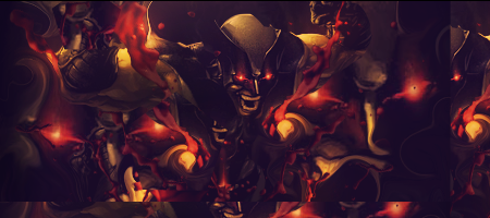
ok so this is my first ever signature. i m a complete newb at photoshop and i know it isnt nearly as good as things you guys would make. please be as strict as possible so i can learn from my mistakes. i know i need c4D's in it but idk how to put them in good or changing the colors of them, so putting that into your comments would be good too. anyway, anything that can help me become better at making sigs is wanted. be completely honest. follow the link to the sig 
http://img638.imageshack.us/img638/2760/ace17sig.jpg
Chris
-

first of save it as a PNG, it will not lower the quality. and don't use text because you just started.
-

Not a bad first attempt I suggest you read a lot of tutorials, try to find tutorials that cover basics like lighting/depth/blending. It looks like your render is a bit squished(?) when resizing it make sure to hold the shift key so it keeps its proportions. Gradient maps are a good way to colour your signatures. Last but not least I suggest not to use spiderman/venom renders as they are whored by the entire gfx community I suggest you read a lot of tutorials, try to find tutorials that cover basics like lighting/depth/blending. It looks like your render is a bit squished(?) when resizing it make sure to hold the shift key so it keeps its proportions. Gradient maps are a good way to colour your signatures. Last but not least I suggest not to use spiderman/venom renders as they are whored by the entire gfx community
-

hahah ok. yea it is squished. gradient maps? care to explain a little further? yea i thought i would start off with something that the whole community is familiar with, spiderman, so that i can get a good start on some things. ill be sure to read every tutorial. any ideas on how to incorporate C4D and stuff into it?
-

Gradient maps are awsome I never really found a tutorial for them tho... They're kinda like a gradient that you place over your image. By experimenting with different layer modes and opacities they can improve blending/colouring by a lot. You can give it a try by going to the layers tab at the top of the page. Next go to new adjustment layer and pick gradient map(I think, on iPod ATM so can't check. Good luck! I never really found a tutorial for them tho... They're kinda like a gradient that you place over your image. By experimenting with different layer modes and opacities they can improve blending/colouring by a lot. You can give it a try by going to the layers tab at the top of the page. Next go to new adjustment layer and pick gradient map(I think, on iPod ATM so can't check. Good luck!
-

ight thanks man. very helpful. how about C4D's? i see people incorporating those but idk how to. any info on them?
-

Sure, c4d's can be found a lot on the Internet, usually with a black background. To avoid a black background filling your signature you can turn its blending mode to screen, linear dodge or colour dodge. Experiment and see wich mode fits the sig and the c4d you are using. Make sure to resize/rotate it untill you found a nice spot for it. You can also erase parts that look bad. Make sure the result has a good flow and don't worry about colouring at first. Once you learn gradient maps and perhaps other ways you can sort out the colouring at the end.
-

ok. u talk about all of the blending and stuff. wut exactly is blending? do i use the magic eraser to erase certain parts? im really new to photoshop so i dont know many tools and wut they do exactly
-

Imo dont start with c4ds, learn them sometime later. Start with brushes. Download Photoshop brushes off of deviantart by looking them up.
Best way to learn photoshop is to start experimenting. Make sure to keep good design in mind and NEVER rush a project. Eventually you'll understand how the blending options work.
Opacity = transparency. Opacity should usually not be used with the default "normal" blending option, but works well with other blending options.
Adjust the image to add color with color balance and adjustment layers. Keep trying these techniques out. Stay away from filters imo other than sharpening and blurring filters.
The easiest way to experiment is to read and follow tutorials. Thats why people suggest them.
(also you should almost never use Bevel and Emboss in a signature, and stay away from those other blending options for layers, for now anyways)
-

I think the first thing you need to know is:
You need to hold Shift when you resize your render/stock. Cause now The render looks streched a bit.
I don't know if it is a bad cutted render... but I can see a line around it.
If it is a bad cutted render you need to search for a better one.
If you added that effects I would remove it. It let stand out too much IMO.
The smudging on the BG is pretty nice.
I also suggest you to look up at some tuts here.
They can be found here:
http://www.gfxvoid.com/forums/forumdisplay.php?f=73
Keep it up mate 
Last edited by cs4pro; 06-23-2010 at 12:46 AM.
 Posting Permissions
- You may not post new threads
- You may not post replies
- You may not post attachments
- You may not edit your posts
-
Forum Rules
|


 Reply With Quote


