0 members and 5,894 guests
No Members online

» Site Navigation

» Stats
Members: 35,443
Threads: 103,072
Posts: 826,684
Top Poster: cc.RadillacVIII (7,429)
|
-
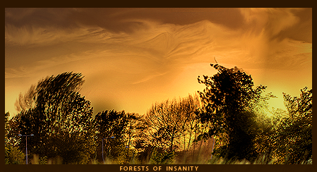
 forests of insanity forests of insanity
for the battle against aether
-
It's not a bad piece and I kinda like the feel to it
The only problem to me is where the sky is smudged?
It doesn't look natural whereas the rest does.
kiu

Challenges:
Posts: 100, 250, 500, 1,000, 2,000
SOTW Wins: 1, 2, 3
-
ehh i like it the way it is 
-
I really like this, i like the what youve done with the trees, does make it look kind of insane, the sky kind of looks like sand dunes ( may not have been the look you were going for but i like it)
Nice work
-
i kinda wanted that forest firey look
-
I think you did a good job on it.I have looked at the sky several times just to make out the shapes of the clouds,and funny thing is I have seen the clouds similar to that before.Nice and clean good smudge work.
-
Remove the border and text. Standard border would you do and you should try positioning the text into an area that won't drag attention away so much as it did, or go without it.
I like the lighting. Could do more with it. Try increasing contrast for a much more appeal of colors. I like the warping of the trees but better blending is needed. Needs a much more solid look. Also, the smudge at the top or w.e looks out of place. Needs more solidity. Work on your contrast and composition. Keep at it!
 Originally Posted by Slave
takken, you sweet boy you, i could eat you 6^
Similar Threads
-
By ROTD in forum Digital Art
Replies: 6
Last Post: 05-26-2006, 08:01 PM
-
By Tenchido in forum Sigs & Manips
Replies: 11
Last Post: 08-02-2005, 06:09 PM
-
By Antagonist in forum Digital Art
Replies: 1
Last Post: 07-06-2005, 06:12 PM
-
By robgasm in forum Digital Art
Replies: 3
Last Post: 06-03-2005, 09:28 AM
-
By Illegalx17 in forum Digital Art
Replies: 17
Last Post: 04-18-2005, 03:44 PM
 Posting Permissions
- You may not post new threads
- You may not post replies
- You may not post attachments
- You may not edit your posts
-
Forum Rules
|


 Reply With Quote


