0 members and 539 guests
No Members online

» Site Navigation

» Stats
Members: 35,443
Threads: 103,072
Posts: 826,684
Top Poster: cc.RadillacVIII (7,429)
|
-
 Stronger Stronger
Blew the whole shit up on some, "What this button do?"
-
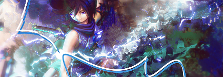
i like your style and smuudgin technique how do you do it? as for the rest of the sig i think the pen tool is unnecessary
-
-
i think some parts look a little LQ and maybe try adding some depth, otherwise great job 
-
I use gimp soo.. I used the Circle brushes, jitter = 1.05, hard edge, and rate 70-100%
Blew the whole shit up on some, "What this button do?"
-
wow i was gna say idk if i like it but its amazing for a gimp piece
-
I like your displacement texture. Looks really sweet man! I do think the pentool lines don't fit though. I do like the lighting but the composition needs improving. The BG still looks messy. Work on that. Keep at it!
 Originally Posted by Slave
takken, you sweet boy you, i could eat you 6^
-
the pen tool seems choppy. But I am really loving the fx on this oen,
good job.

Challenges:
Posts: 100, 250, 500, 1,000, 2,000
SOTW Wins: 1, 2, 3
Similar Threads
-
By chonfat in forum Sigs & Manips
Replies: 2
Last Post: 03-16-2010, 04:39 PM
 Posting Permissions
- You may not post new threads
- You may not post replies
- You may not post attachments
- You may not edit your posts
-
Forum Rules
|


 Reply With Quote

 , and i wish your render was alittle more clean, meaning it looks alittle flat with the background, and the colors are slightly messy in the hair and face


