0 members and 3,911 guests
No Members online

» Site Navigation

» Stats
Members: 35,443
Threads: 103,072
Posts: 826,684
Top Poster: cc.RadillacVIII (7,429)
|
-
 Kick-Ass Kick-Ass
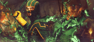
V2:
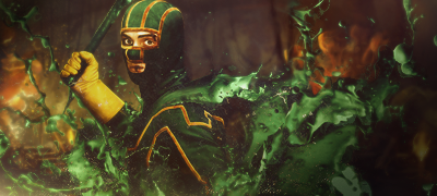
CnC
Last edited by marioman77; 06-30-2010 at 08:06 PM.
-
I think you should bring out the lighting more, Im digging the fx I think you should add some yellow in them but pretty sick anyways nice job.
Blew the whole shit up on some, "What this button do?"
-
Totally agree with Maietrix! add some yellow into the effects maybe add a gradient map on screen but really lower the opacity  and bring out some stronger lighting! good job! kiu!! and bring out some stronger lighting! good job! kiu!!
-
Add a border.
Add a yellowish light source and it would look so much better.
Very nice signature.
-
Added V2  and thanks for the comments guys and thanks for the comments guys
-
I like the splash effect there mate. AN extra tone of color like yellow would really help this piece in terms of color scheme and contrast. I do think the splash effect is too overwhelming however. Tone it down a notch and use a more finer, variety I think the BG can use some darkened blend and a nice fine texture to go with it. Lighting is poor in the piece. Work on composition and color scheme and lighting. Keep at it!
 Originally Posted by Slave
takken, you sweet boy you, i could eat you 6^
-
I am absolutely loving the effects ;D
v2 is better but needs a better light source imo too bring out the render more.
keep up the awesome work

Challenges:
Posts: 100, 250, 500, 1,000, 2,000
SOTW Wins: 1, 2, 3
Similar Threads
-
By Xelo in forum Sigs & Manips
Replies: 9
Last Post: 03-05-2010, 12:56 AM
-
By funn in forum Sigs & Manips
Replies: 3
Last Post: 09-05-2009, 10:02 AM
-
By KidBuu in forum Sigs & Manips
Replies: 10
Last Post: 01-20-2009, 08:50 PM
-
By Freak in forum Sigs & Manips
Replies: 7
Last Post: 09-20-2005, 08:36 PM
-
By Nobunaga in forum Introductions
Replies: 5
Last Post: 08-22-2005, 12:38 AM
 Posting Permissions
- You may not post new threads
- You may not post replies
- You may not post attachments
- You may not edit your posts
-
Forum Rules
|


 Reply With Quote