0 members and 7,289 guests
No Members online

» Site Navigation

» Stats
Members: 35,443
Threads: 103,072
Posts: 826,684
Top Poster: cc.RadillacVIII (7,429)
|
-
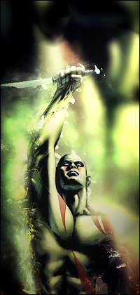
 SS round 1~Shivs Entry SS round 1~Shivs Entry
CnC
-
I liked this one but I thought the background was over blurred.
nice work though mate, kiu

Challenges:
Posts: 100, 250, 500, 1,000, 2,000
SOTW Wins: 1, 2, 3
-
Same as bcfcant.
i like it allot but background is way to over blurred.
-
Darn...
I think I was trying to whore my depth.
o well lol
-
it does create depth but with i little bit less blur it looked better 
Sorry for the grammar? ;p
-
I like the colors you used but your blending wasn't up to scratch. Also, lack of elements in the piece with such a canvas and composition was a bad idea. Learn to arraign consistent, yet varied elements and incorporate them into your canvas to improve composition. Lighting is bad as well. Work on composition and lighting and blending. Keep at it!
 Originally Posted by Slave
takken, you sweet boy you, i could eat you 6^
-
Alright Man
Thanks For the FeedBack
Similar Threads
-
By shiv96 in forum Member Portfolios
Replies: 6
Last Post: 10-11-2010, 11:15 AM
-
By Aether in forum Sigs & Manips
Replies: 3
Last Post: 07-01-2010, 12:27 PM
-
By Lith in forum Sigs & Manips
Replies: 5
Last Post: 07-01-2010, 07:11 AM
-
By zole in forum Sigs & Manips
Replies: 9
Last Post: 07-01-2010, 07:05 AM
-
By shiv96 in forum Sigs & Manips
Replies: 7
Last Post: 02-04-2010, 06:13 PM
 Posting Permissions
- You may not post new threads
- You may not post replies
- You may not post attachments
- You may not edit your posts
-
Forum Rules
|


 Reply With Quote


