0 members and 741 guests
No Members online

» Site Navigation

» Stats
Members: 35,443
Threads: 103,072
Posts: 826,684
Top Poster: cc.RadillacVIII (7,429)
|
-
 Observation Observation
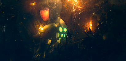
v2
Last edited by Dron; 07-03-2010 at 07:05 AM.
-
I like the sig but colours need work, especially on the renders face.
Also I don't think the green on the renders back is suiting the sig but is keeping it from coming monotone imo.
Not my fav from you but not bad, KIU.

Challenges:
Posts: 100, 250, 500, 1,000, 2,000
SOTW Wins: 1, 2, 3
-
thanx!
ye it was mad hard to adjust colors on this one, since stock and render was too monotone and i was too lazy to color things myself lol
-
Needs more tones of contrast but concentrate on your lighting. Lighting has always been your strongest point IMO, but your weakest as well when you fail to use it right and its because of your style. Make the element on bust bigger and position more down and to the left and increase the lighting by your heard. Make use of the green stuff on her shoulder.
 Originally Posted by Slave
takken, you sweet boy you, i could eat you 6^
 Posting Permissions
- You may not post new threads
- You may not post replies
- You may not post attachments
- You may not edit your posts
-
Forum Rules
|


 Reply With Quote

