GFXVoid Graphic Design Forum

Remove Text Formatting
Loading...

» Online Users: 6,330

0 members and 6,330 guests
No Members online

» Site Navigation

 > FAQ

» Stats

Members: 35,443
Threads: 103,072
Posts: 826,684
Top Poster: cc.RadillacVIII (7,429)
Welcome to our newest member, Lekelindids
Results 1 to 2 of 2

Thread: new ones!

  1. #1
    Join Date
    Jul 2010
    Location
    USG Ishimura
    Posts
    919

    Default new ones!

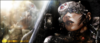
    i admit they are both horrible i was on an artist block while doing this so i didnt have much imagination.. and my internet has been out for two days so i spent my time doing these


    the last one might look familiar.. i followed a tut to do it and used the same stock i am not going to use any of them..

  2. #2
    Join Date
    Jul 2010
    Location
    Around.
    Posts
    646

    Default

    Quote Originally Posted by xSattisfaCtioNz View Post
    i admit they are both horrible i was on an artist block while doing this so i didnt have much imagination.. and my internet has been out for two days so i spent my time doing these


    the last one might look familiar.. i followed a tut to do it and used the same stock i am not going to use any of them..
    Truthfully, yeah, they're all a little plain. I think if you were gonna keep working on any of them though, it should be the second one. It has the most potential out of all of them. It's got a very clean compo, nice colors, just needs something a little more to make it pop. I'd also say it's the only one that the border actually really works with. Not bad stuff, at least, on the first two, I'm not really liking your last one, and yeah, I know it's a tutorial tag, but ehh... There's nothing really going on there to interest me.


    SOMETIMES I LIKE TO CREATE THINGS


Posting Permissions

  • You may not post new threads
  • You may not post replies
  • You may not post attachments
  • You may not edit your posts
  •  
Powered by vBadvanced CMPS v4.1.1