GFXVoid Graphic Design Forum

Remove Text Formatting
Loading...

» Online Users: 694

0 members and 694 guests
No Members online

» Site Navigation

 > FAQ

» Stats

Members: 35,443
Threads: 103,072
Posts: 826,684
Top Poster: cc.RadillacVIII (7,429)
Welcome to our newest member, Lekelindids
Results 1 to 9 of 9

Thread: Dunk

  1. #1
    Join Date
    May 2010
    Location
    Australia
    Posts
    1,223

    Default Dunk

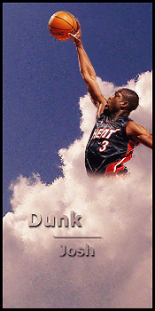
    Well Basically I was bored so I made this

    I know it's very basic with little effect but I thought it looked nice.


    So any feedback will be appreciated.

    Edit:
    Made it Vertical as recommended by DR809
    Last edited by +Josh Fx; 07-19-2010 at 04:26 PM.

  2. #2
    Join Date
    Jul 2009
    Location
    Brooklyn, New York
    Posts
    1,604

    Default

    There's too much open space. Would've came out better as a vertical sig.

    My Three Rules Of Making a Sig Flow, Lighting and Depth


  3. #3
    Join Date
    May 2010
    Location
    Australia
    Posts
    1,223

    Default

    Oh good idea . I'll give that a shot thanks.

    As I said it's meant to basic

  4. #4
    Join Date
    May 2010
    Location
    Australia
    Posts
    1,223

  5. #5
    Join Date
    Mar 2010
    Location
    New Zealand
    Posts
    129

    Default

    try sharpening some bits and bluring some and too much empty space i ahgree with DR809
    .:: Favourite ::.


    .:: Newest ::.


  6. #6
    Join Date
    Jun 2010
    Location
    New york
    Posts
    155

    Default

    Too simple. And also there a floating dwayne wade... lol. But add some depth to it.

  7. #7
    Join Date
    Jul 2010
    Location
    Around.
    Posts
    646

    Default

    I'd keep it horizontal if you don't have a full body version of the stock. Even some really simple duplicating effects, or some smudging of the clouds could be cool. I'd also make the text a little more subtle. Drop the line out in the middle of the words, and make the drop shadow just a little less obvious.

    Cool tag though. I like the idea.


    SOMETIMES I LIKE TO CREATE THINGS


  8. #8
    Join Date
    May 2010
    Location
    Australia
    Posts
    1,223

    Default

    oh I got a full body stock.

    I just didn't like how it looked. I tried to make it look like he was coming out of the cloud.

    I probably should of taken more time and effort into it. Didn't take long to make.

    But thanks for the comment. I appreciate all types of advice

  9. #9
    Join Date
    Jul 2010
    Location
    USG Ishimura
    Posts
    919

    Default

    that would look really good vertical.

Similar Threads

  1. Total Smudge: Super Dunk
    By KidBuu in forum Sigs & Manips
    Replies: 3
    Last Post: 04-09-2009, 12:03 PM

Posting Permissions

  • You may not post new threads
  • You may not post replies
  • You may not post attachments
  • You may not edit your posts
  •  
Powered by vBadvanced CMPS v4.1.1