0 members and 1,022 guests
No Members online

» Site Navigation

» Stats
Members: 35,443
Threads: 103,072
Posts: 826,684
Top Poster: cc.RadillacVIII (7,429)
|
-
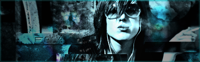
 Smoke tag Smoke tag
Was actually meant to be an experiment, but I like how it turned, so I'm now asking for constructive criticism:

-
It's not bad, the effects are good, I like the sections where you've duplicated parts of the image. Most of the time when you see that it's done with a splatter brush and clone tool so it's good to see something different.
I like the way you've done the text as well only I'm not too sure about the font something less pixel looking would be better I think.
I actually quite like the way its all blue but the 2 purple sections look a little odd, try adding more or making them blend in with the blue more.
Then just try and get the face to stand out better, maybe sharpen it or lighten the face and darken the bg, just sumin to help it stand out.
It looks nice though, I really like the style good job.
Fav:

Latest:

-
 Originally Posted by Draywin848

It's not bad, the effects are good, I like the sections where you've duplicated parts of the image. Most of the time when you see that it's done with a splatter brush and clone tool so it's good to see something different.
I like the way you've done the text as well only I'm not too sure about the font something less pixel looking would be better I think.
I actually quite like the way its all blue but the 2 purple sections look a little odd, try adding more or making them blend in with the blue more.
Then just try and get the face to stand out better, maybe sharpen it or lighten the face and darken the bg, just sumin to help it stand out.
It looks nice though, I really like the style good job.
Well, I actually put those pink dots on purpose to create some contrast to the blue, but I followed your advices and blended the pinkish dots more in, blurred the bg, and added lighting.
-
The focal point is definitely more obvious now but i would lighten up the area where the text is just so its easier to see.
Aside from that good, love to see more in this style.
Fav:
Latest:
-
The problem with color is that if you only add a tiny bit of another color, it looks a little off. If you were gonna add more, do more with it than just two little spots, it looks a bit awkward like that. I'd try to change the aliasing f your font, to make it a little smoother, and less pixelly.
Again, gonna second pretty much everything Draywin said.
Very cool. 


SOMETIMES I LIKE TO CREATE THINGS
-
iv seen this before....
http://www.tutzone.org/2009/05/29-aw...res-using.html
he either followed the tut or stole it..
-
He followed the tut, the render and general style might be the same but he's added his own style to it as well.
Fav:
Latest:
-
too monotonish for my taste, text could use some work and as ive recommended before i belive its better to just do white or black color borders cause the other colors pretty much kill the tag... anyway KIU bro
Favorite and Most Recent  :

-
Similar Threads
-
By zole in forum Sigs & Manips
Replies: 7
Last Post: 04-05-2009, 06:53 AM
-
By Lew in forum Sigs & Manips
Replies: 10
Last Post: 10-18-2008, 09:45 PM
-
By zole in forum Sigs & Manips
Replies: 17
Last Post: 09-17-2008, 03:10 PM
-
By septicX in forum Sigs & Manips
Replies: 4
Last Post: 11-20-2006, 04:20 PM
-
Replies: 67
Last Post: 03-29-2006, 11:31 AM
 Posting Permissions
- You may not post new threads
- You may not post replies
- You may not post attachments
- You may not edit your posts
-
Forum Rules
|


 Reply With Quote


