0 members and 1,361 guests
No Members online

» Site Navigation

» Stats

Members: 35,443
Threads: 103,072
Posts: 826,684
Top Poster: cc.RadillacVIII (7,429)
|
-
 Hey all! New to PS! Hey all! New to PS!
Hey all,
I'm new to using Photoshop and computer graphics, but I read up a few tutorials and manage to come up with a signature. Looking for any sorts of constructive criticism!

New (Hopefully Improved Signatures)

Same thing but with a bit of splattering and clipping.

Last edited by nobodyuknow; 08-13-2010 at 10:15 PM.
-

wow ) u need add more blending to pikachu or something else...and need read more tutorial,too bright signature here.
Club Claro Member Signature (made by myself):

My last signature:

Gift from Radillac:

-

I won't lie. The signature is poor. Cannot see the focal as it's all the same shade of yellow, text sucks and it's overly bright.
-

Its not bad for one of your first, but try and get more clarity, what I mean is pikachu is a bit hard to see, so maybe make the background darker then pikachu's shade of yellow. I like how you used the pokemon font, overall its too bright so I can't really see what you've done, darken the sig up a bit.
-

Read some tuts. You'll get better. 
-

 Originally Posted by RunningMan

Read some tuts. You'll get better. 
Basically what Run says, if you need some beginner and starter tuts, pm me. I got some.
Imo, the void is a bit hard to start off. Not saying you shouldn't stay, but it's a bit difficult to start off, not many basic tutorials.
Read up on some techniques and tuts somewhere else and post your work here for cnc.
Then you'll get great feedback as well, just make sure you're prepared for it, if you get offended easily then there really isn't a point in asking for criticism.
That's just what I think though.
What you should do is start off by learning the basics.
Smudging, lighting, flow and stuff like that.
Smudging is a really handy technique, try to find some tutorials on YouTube for beginners.
There might not be much tutorials on lighting, but try to look for some. If not, I can explain it to you.
Flow is just basically the direction of where your effects and signature go.
Just to point out an example, RunningMan's first signature, as you can see the flow is going downwards, that's the direction.
Or upwards? Well, you should understand what I mean.
So just try to keep flow in your signature.
I know I might sound like a hypocrite because I usually don't keep flow, but that doesn't mean you shouldn't  ! !
These are just the basics though. Tbh, when I started Photoshop I let myself experiment a little bit and I watched other people making signatures on YouTube, it give's you a good idea of what to do.
Then once you develop a style and you know the basics then I suggest looking at tutorials here.
This is all in my opinion, you're free to do whatever you want  . .
Last edited by Derosion; 08-12-2010 at 12:53 PM.
-

All right, thanks a bunch guys, I'll try work on it a bit more and hopefully come up with a new and improved signature.
-

Work on your blending. Also never but your text in the corners you usually want to put it close to the render, that way it does not fuck up the focal.
That is all the advice I can give you.
-

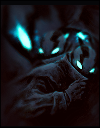
Well, I've looked at a few more tutorials and read your comments and now, have made a new signature. Please tell me if it's an improvement or not, and what should and can be changed.

I also wanted to mess around with some splatter brushes and tried to make it not so plain around Lugia...

-

The splatter is serving no purpose at all, Colour scheme of the splatter doesn't match at all and it takes away from the focal.
And to me I think there's nothing worse than a name that is like multiple words long or just a really long name. IMO keep it short, it helps you blend in with the theme, E.g Nuro. Running man is long so he uses "RUN" etc etc.Maybe shorted it to NYK or something.
 Posting Permissions
- You may not post new threads
- You may not post replies
- You may not post attachments
- You may not edit your posts
-
Forum Rules
|


 Reply With Quote


 .
.


