0 members and 4,615 guests
No Members online

» Site Navigation

» Stats
Members: 35,443
Threads: 103,072
Posts: 826,684
Top Poster: cc.RadillacVIII (7,429)
|
-
 Music is emotion Music is emotion
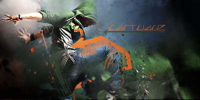
Another smudge sig. Whadaya guys think?


My Three Rules Of Making a Sig Flow, Lighting and Depth
-
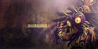
I truly love it  Love the clipping mask you did with it, never changing the mellow feel. Her face is so focused ( an beautiful! ) Love the clipping mask you did with it, never changing the mellow feel. Her face is so focused ( an beautiful! )
 Radi's one of a kind gift <3
 ^My Wish List^

-
very nice feel to this one, I like it better than your other one, which I also like. The flow is decent, as is the colors. the text could use a little work, or be removed and it would help the sig. Light color font over light color bg doesn't typically look good. try a darker font, or move the lighter font over to the left a lil and up a small amount. gj Dr KIU
-
Thanks for the criticism Domino, just means I'm improving . Hmmmm I'll see what I can do with the text
My Three Rules Of Making a Sig Flow, Lighting and Depth
-
My Three Rules Of Making a Sig Flow, Lighting and Depth
-
you need more detail in the background, making it pretty flat right now. I think your clipping masks are a little too overpowering in this one. Flow is okay. Text is pretty good! Keep it up.
-
looks pretty good, the blending is weird because you just let her knee pop out, its kind of distracting
I personally love clipping masks I went through a phase where those were my effects lol, the ones near the bottom left are nice, but that one that sort of shoots out of her stomach sort of ruins flow, background is also dull, u can try smudging it a little then use blur/sharpen/burn for depth
Old but most recent.
 Originally Posted by Tyler Durden
Sticking feathers up your butt does not make you a chicken.
-
IMO the flow is a bit thrown off by the outward going clipping mask lines.
Effects are nice, colors could use a bit more vibrancy.
I would suggest changing the texts blending layers, the text could look much better if it were not so white.
-
Okay, this is sick. But I think you could use some little tweaks on it here and there to really make it pop.
Rotate your text, to go with the flow of your clipping mask/splatters. Tone it done a little as well, either darken it a little, or lower the opacity. Just a little though, the type itself looks good.
Tone down her knee just a little bit as well. sticks out too much. The splatter popping out of her stomach looks good, but it's grabbing just a bit too much attention.
I really love the colors on this one, same with the effects, and your smudging is tight. Love the feeling and atmosphere. The mellowness to it is very nice, focal is good, flow is good. Very good work overall <3


SOMETIMES I LIKE TO CREATE THINGS
Similar Threads
-
By zahradkar in forum Sigs & Manips
Replies: 5
Last Post: 10-12-2009, 07:53 PM
-
By MarkPancake in forum Sigs & Manips
Replies: 8
Last Post: 03-19-2009, 01:15 PM
-
By Sinclair in forum Digital Art
Replies: 2
Last Post: 04-20-2006, 08:58 PM
-
By Gyroxide in forum Digital Art
Replies: 2
Last Post: 06-05-2005, 03:22 PM
 Posting Permissions
- You may not post new threads
- You may not post replies
- You may not post attachments
- You may not edit your posts
-
Forum Rules
|


 Reply With Quote