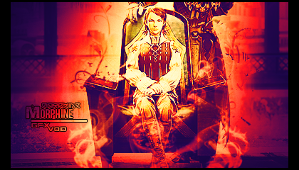
It looks like you have some nice effects, but all the contrast is blinding... so you cant see them as well. I would suggest lower the opacity on the layers that are causing all those really bright oranges and reds.
Then lower the opacity on the sharpening layers and see about getting a LIGHT topaz clean (if you have it).
gw
I don't have topaz, wish I did but thank's and it looks like its over sharpened because thats how it was I had no part in that:P
I second everything Kritez said. Don't really like the text either. I'd tone it down. Plus I have a hate on for stroked text, I find it's generally not appealing.
It makes it more visible, but at the same time, doesn't look good. In this respect, you have to ask, is the purpose of your sig to convey the message of whatever is on the text, or is it more of another visual element to add to the look of the tag?
That's the best way to really decide if you even need text, or how to do it.
At least, that's how I think anyhow. I'unno, random odd tip on type, I suppose.


 Reply With Quote


