0 members and 605 guests
No Members online

» Site Navigation

» Stats
Members: 35,443
Threads: 103,072
Posts: 826,684
Top Poster: cc.RadillacVIII (7,429)
|
-
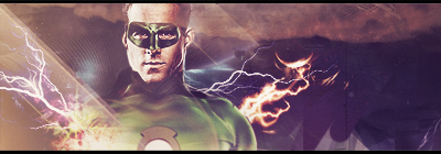
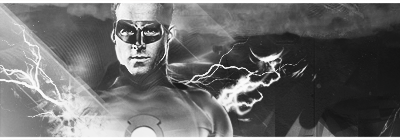
 Green Lantern Green Lantern
Made a B&W version as well as colored. If you like either of them, which one do you like? CnC is appreciated as well:
Colored:
B&W:
-
Favorite and Most Recent  :

-
sorry bud, had to put a border on em, lol, so i deleted em. they're back up though
-
I'm not sure, not too keen on the stripes on the left, and the B&w is definately worse
-
lol, alright, love the hate crit, that's always nice. thx
-
the effects dont look bad, but i think you could have spend alittle more time on them and their placement. the colors in the first one are very very interesting, i think it might be better with alittle more green, but thats my personal opinion.
Other than that you have a very interesting style, im not really sure what to make of it right now.
Keep it up, i want to see more
-
colour is much better , effects are nice but try spreading the effects on the right
because the right side is empty
but nice (:
-
I find the color of your effects clash a little. The fire especially. The colors work throughout the rest of the piece, but the fire sticks out too much against the dark background, and steals too much focus.
I like the style though. Feels like it could use a tiny bit more though.


SOMETIMES I LIKE TO CREATE THINGS
Similar Threads
-
By Tatsujin79 in forum Sigs & Manips
Replies: 8
Last Post: 08-05-2010, 12:51 AM
-
By Spardaa in forum Sigs & Manips
Replies: 1
Last Post: 06-15-2010, 06:48 PM
-
By cC.Dispeller in forum Sigs & Manips
Replies: 4
Last Post: 01-08-2010, 09:56 AM
-
By +s9.Oath in forum Sigs & Manips
Replies: 6
Last Post: 08-13-2009, 02:26 PM
-
By Victor76 in forum Sigs & Manips
Replies: 3
Last Post: 08-01-2009, 06:16 AM
 Posting Permissions
- You may not post new threads
- You may not post replies
- You may not post attachments
- You may not edit your posts
-
Forum Rules
|


 Reply With Quote


