0 members and 4,414 guests
No Members online

» Site Navigation

» Stats
Members: 35,443
Threads: 103,072
Posts: 826,684
Top Poster: cc.RadillacVIII (7,429)
|
-
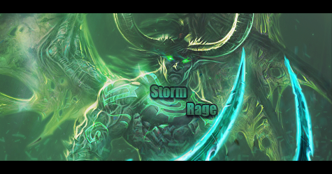
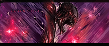
 Bogga's Sig Gallery Bogga's Sig Gallery
These are just a couple sigs ive done enjoy!
Without Topaz:


V2.0

With Topaz:


-
Man there's alot. My favorite outta Topaz. is Mario And my favorite without topaz is "The greatest" one.
-
I like only one out of all of em. The text on em throws em off.
You shouldn't use the most coolest font with like a grungy look to em because its hard to read and downgrades a signature. Simple fonts can be affective.
You want to put the text as close to the focal as you can because if its to far off than its distracting and makes the signature not as good.
If I was you I wouldn't put the text outside the borders since it ruins the flow.
You should use a Light Source and smudge more to give it more depth in a signature.
if you don't know how to do that i'm sure if you look at the signature tutorials that they will tell you examples on how to do depth,flow,more details,etc
Edit: I seen on some of the signatures you did do a light source but you put a big white,blue,etc color in the dead middle which it makes it look bad, get a soft brush and have the edges of the soft brush touch a little down, there a different ways in doing it so you will figure out a couple different ways.
Last edited by Foxx Z; 08-31-2010 at 05:45 PM.
-
 Originally Posted by Foxx Z

I like only one out of all of em. The text on em throws em off.
You shouldn't use the most coolest font with like a grungy look to em because its hard to read and downgrades a signature. Simple fonts can be affective.
You want to put the text as close to the focal as you can because if its to far off than its distracting and makes the signature not as good.
If I was you I wouldn't put the text outside the borders since it ruins the flow.
You should use a Light Source and smudge more to give it more depth in a signature.
if you don't know how to do that i'm sure if you look at the signature tutorials that they will tell you examples on how to do depth,flow,more details,etc
Edit: I seen on some of the signatures you did do a light source but you put a big white,blue,etc color in the dead middle which it makes it look bad, get a soft brush and have the edges of the soft brush touch a little down, there a different ways in doing it so you will figure out a couple different ways.
OMG! Thanks for the advice lol.
*Edit* Which one did you like.
-
I personally like the third one from the bottom.
Foxx has some good tips imo, aside from that i could reccomend looking up some tutorials and just keep posting your future works
-
Originally Posted by Bogga
OMG! Thanks for the advice lol.
*Edit* Which one did you like.
This one could have potential in it since it kinda gives some blend towards the BG.
but I don't like the text.
What bother though it seem like the cloud effect is going one way and the BG is going another way, you should make all effects go the same way.
I didn't see this in any of your other signatures (I could be wrong) but try Clipping Masking.
If you want me to explain what that is I will.
What a good idea is use blur the background and it makes the focal (face, glowing hands, etc) more depth.
Do you know how to use Gradient Maps?
-
Originally Posted by Foxx Z
This one could have potential in it since it kinda gives some blend towards the BG.
but I don't like the text.
What bother though it seem like the cloud effect is going one way and the BG is going another way, you should make all effects go the same way.
I didn't see this in any of your other signatures (I could be wrong) but try Clipping Masking.
If you want me to explain what that is I will.
What a good idea is use blur the background and it makes the focal (face, glowing hands, etc) more depth.
Do you know how to use Gradient Maps?
Yes i just learned hoe to use them recently.
-
Originally Posted by Bogga
Yes i just learned hoe to use them recently.
Okay well here are some Gradient Maps I use.
Gradient Map Black & White + Luminosity.
Gradient Map Black & White + Multiply makes the signature more "Dark"
If you gonna use different colors than that than use lite colors.
Use adjustment layers like Curves, Levels, Selective Color, other ones I can't remember. just mess around with the settings.
Btw for the light setting for what I do is fill the layer all black and set it to Linear Dodge, than get a white 200-300 soft brush and place it where the render reflects off of.
I use another way but you got to have Photoshop CS5.
Also another trick I use is hit CTRL+SHIFT+ALT+E which Applys Image and go to Filter-Other-High Pass and set it to 0.5 and than put it to Overlay. its brings the picture out more.
Similar Threads
-
By Aveaon25 in forum Sigs & Manips
Replies: 0
Last Post: 03-08-2009, 09:11 PM
-
By Allan in forum The Void
Replies: 6
Last Post: 06-22-2006, 10:08 AM
-
By Lee_JR in forum Sigs & Manips
Replies: 3
Last Post: 04-18-2006, 03:16 PM
-
By Rorin in forum Sigs & Manips
Replies: 5
Last Post: 11-13-2005, 10:10 PM
 Posting Permissions
- You may not post new threads
- You may not post replies
- You may not post attachments
- You may not edit your posts
-
Forum Rules
|


 Reply With Quote