GFXVoid Graphic Design Forum

Remove Text Formatting
Loading...

» Online Users: 8,296

0 members and 8,296 guests
No Members online

» Site Navigation

 > FAQ

» Stats

Members: 35,443
Threads: 103,072
Posts: 826,684
Top Poster: cc.RadillacVIII (7,429)
Welcome to our newest member, Lekelindids
Results 1 to 7 of 7

Thread: grimjow sig

  1. #1
    Join Date
    Sep 2009
    Location
    nanananannannanan , bat- england
    Posts
    1,729

    Default grimjow sig


    cnc and a few tips would be handy

  2. #2
    Join Date
    Aug 2010
    Location
    Cyprus
    Posts
    337

    Default

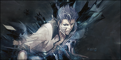
    i would firstly erase that letters that are on low opacity on his shirt near his hand.
    needs a bit more lighting imo.try playing a bit with contrast&brightness.

    i like it alot !:P more than the other with chaotic focals :P

  3. #3
    Join Date
    Sep 2009
    Location
    nanananannannanan , bat- england
    Posts
    1,729

    Default

    i just noticed the writing on his shirt XD
    yeah this one is less chaotic xD
    i shall try to work on lighting and contrast
    thanks

  4. #4
    Join Date
    Aug 2009
    Posts
    273

    Default

    Not bad, a little monotone for my tastes but thats just a taste thing. Your execution is very good and it's clean too. Nice job with the effects and flow.


  5. #5
    Join Date
    Sep 2009
    Location
    nanananannannanan , bat- england
    Posts
    1,729

    Default

    thanks
    it is a quite monotone if i must admit but thats my style really

  6. #6
    Join Date
    Jun 2010
    Location
    England (WOOOOT!)
    Posts
    1,601

    Default

    Try and get out your smudge tool and smudge the letters out, or get xelo or someone to do it - xelo is good at that


  7. #7
    Join Date
    Aug 2008
    Location
    The netherlands
    Posts
    903

    Default

    Great Concept, But you dropped a few eyecatching points

    At first: This Sig needs some light! Use Dots, Dodge tool, Adjustment Layers. Create that sparkly Focal.
    The Background is a little boring, when you use a render, make a bg with the render it self, or a stock. Blur the bg to make the focal even more eyecatching, Don't use Plain Bg's
    And at last: The text should be on a different spot, probably against 1 side of a C4D. I'd rather use simple white/black text to keep it as less attracting.

    Good Job anyways

    WHAT'S THIS?! A SIGNATURE?

Similar Threads

  1. Grimjow
    By Samuel in forum Sigs & Manips
    Replies: 7
    Last Post: 04-24-2009, 09:05 PM

Posting Permissions

  • You may not post new threads
  • You may not post replies
  • You may not post attachments
  • You may not edit your posts
  •  
Powered by vBadvanced CMPS v4.1.1