0 members and 4,885 guests
No Members online

» Site Navigation

» Stats
Members: 35,443
Threads: 103,072
Posts: 826,684
Top Poster: cc.RadillacVIII (7,429)
|
-
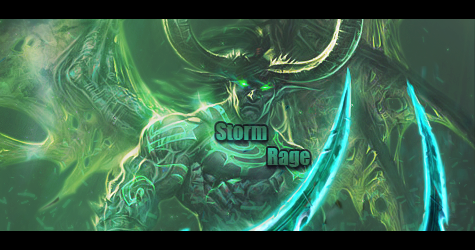
 New sig New sig
I just finished upon my latest sig.

Any Comments or Critisism would be very much apreciated.
-
Fat unnecessary border.
For some reason, your signatures have very little contrast.
They're always so, white ..
-
They're always so bright and colorless, add some colors. And I agree with mega about the border, Other than that I like =P
Last edited by Darkened_Soul; 09-03-2010 at 04:45 PM.
-
Borders are preference, I personally hate small border, 1 pxl borders, etc. I figure if you're going to add a border it should do something for the tag or at the least set it apart as Spardas do.
Nice effects mate.
-
I dislike that "thing" on the left
-
 Originally Posted by Mega

Fat unnecessary border.
For some reason, your signatures have very little contrast.
They're always so, white ..
I suppose the border, like Gallegher said, is a matter of taste.
As for the low contrast, its a specific look, i dont always use it.
some might like it, some might dislike it.
I Personally think it makes things look a bit more smooth.
Originally Posted by Darkened_Soul
They're always so bright and colorless, and some colors. And I agree with mega about the border, Other than that I like =P
These last few are indeed kinda bright, that kinda goes with the "low contrast" thing mega mentioned before.
Originally Posted by Spartan_killer
I dislike that "thing" on the left
You mean the small border?, that might have indeed been a bit useless, but I personally didn't see any harm in it :P
Thanks for the comments folks, any more CnC would be most welcome.
-
Sorry, i said left but meant right
-
A small update for the border haters 

Anymore CnC?
-
But its not even a border its quarter of a border...
thanks naruto <3


Originally Posted by littlefeet
they say until it happens they wont believe it, but if it ever does happen, they'll say it didn't actually happen. So it can actually never happen to them, even if it does happen to them
<< LOL
-
No design law states you need to have a full border all arround
 Posting Permissions
- You may not post new threads
- You may not post replies
- You may not post attachments
- You may not edit your posts
-
Forum Rules
|


 Reply With Quote