0 members and 4,595 guests
No Members online

» Site Navigation

» Stats
Members: 35,443
Threads: 103,072
Posts: 826,684
Top Poster: cc.RadillacVIII (7,429)
|
-
 new sig new sig
URL=http://img801.imageshack.us/i/firsteversig.jpg/] [/URL] [/URL]
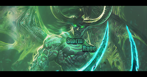
i posted this before but i have changed it a bit and changed the text along with adding a c4d into it since i never really knew how to do it. but anyway, how is it? i m open to any critisim no matter how harsh it is. but keep in mind, im a newb at photoshop and this is my first ever sig that is actually have decent in my eyes.
-
I like it. The colors and the background astound me. It's awesome at the top how the render blended. Kiu. 
-
thanks. anything that needs to be fixed? and anyone else?
-
Um birth of a hero text is a bit overrated when it comes to sigs imo.
I'm also trying to figure out what the flow is seeing how the smudging is all over the place.
Some parts of the focal are a bit over contrasted and you should work on lighting. kiu.

My Three Rules Of Making a Sig Flow, Lighting and Depth
-
ok yea i just got done reading a tutorial saying dont use a static render, but one that has movement or flow to it which mine lacks. ill be sure to fix it in my next signature. how about the text? how can i fix that? also, how do i add a border to this too?
-
The colour theme is well done (except for the light blue text).
I would recommend you work on having a central focus point in your next sig/piece. In your current sig you should have the render as the focus, keep the detail around him. You could do this by sharpening the focal point, blurring the periphery, or adding dark gradients to the periphery. All which draw attention towards the focus, the render.
-
ok thanks. how can i fix the text as well? like wut kind of text should i use for this signature? cause i mean i read in alot of places to use Arial or Verdana but i mean i had those before but they just like didnt look good.
Most Recent: 
First Ever: 
-
Birth of a hero, big big no no no. Try dafont
-
-
ok i know its a no no. im having trouble deciding wut kinds of texts i should use for sigs and how i know which will be good for it. any ideas?
Most Recent:
First Ever:
 Posting Permissions
- You may not post new threads
- You may not post replies
- You may not post attachments
- You may not edit your posts
-
Forum Rules
|


 Reply With Quote