GFXVoid Graphic Design Forum

Remove Text Formatting
Loading...

» Online Users: 253

0 members and 253 guests
No Members online

» Site Navigation

 > FAQ

» Stats

Members: 35,443
Threads: 103,072
Posts: 826,684
Top Poster: cc.RadillacVIII (7,429)
Welcome to our newest member, Lekelindids
Results 1 to 7 of 7

Thread: Shangry

  1. #1
    Join Date
    Sep 2009
    Location
    New Jersey
    Posts
    4,752

    Default Shangry

    New Piece
    CnC!


  2. #2
    Join Date
    Dec 2006
    Posts
    5,223

    Default

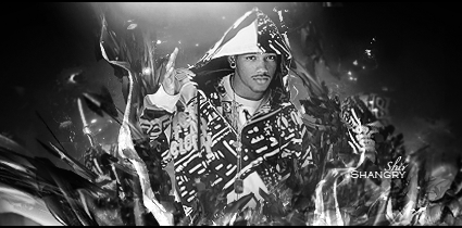
    text is harsh to see u have to squint your eyes to see it over there bad placement imo um your lighting looks like it's working , um your c4d effect might be a tad too much but thats just me . i see u lost a hand in it . but over all I'm have to say B/W is best not really digging your one in color sry bro . kiu tho you can make wicked tags I've seen them but this just not one of em . ttyl ps sry left this out where u erased the c4d's? by his waist line seems a little flat try smoothing that out more . k peace out man hope my cnc helps some if not well sry i tried .
    Last edited by sirenzo; 09-07-2010 at 06:24 PM.


  3. #3
    Join Date
    Sep 2009
    Location
    New Jersey
    Posts
    4,752

    Default

    Thanks siren, really helped bro. I'll make a v2 if I can. Also, i modeled this of of Kri's kanye piece, just kinda jazzed it up lol


  4. #4
    Join Date
    Dec 2006
    Posts
    5,223

    Default

    nps man glad i could be of some help can't wait to see your updates ttyl m8


  5. #5
    Join Date
    Aug 2010
    Location
    Canada
    Posts
    3,286

    Default

    I like it it but there is no luv yet :P

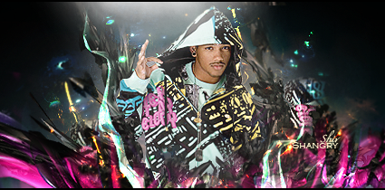
    Hi left arm ( the pink shat writting on his hoodie) kinda makes it look very flat :/ but I see that colour helps you bring in the pink below him. I would say try an change the colour on his hood if you could or make it less flat somehow ( sry have no tips I don't often work on rl renders : /)

    Radi's one of a kind gift <3

    ^My Wish List^


  6. #6
    Join Date
    Sep 2010
    Location
    Indiana, USA
    Posts
    126

    Default

    nice job!
    Good flow, and effects.
    Stuck with the same colors and gave it a nice look
    KIU

  7. #7
    Join Date
    Sep 2009
    Location
    New Jersey
    Posts
    4,752

    Default

    Thanks Josh!


Posting Permissions

  • You may not post new threads
  • You may not post replies
  • You may not post attachments
  • You may not edit your posts
  •  
Powered by vBadvanced CMPS v4.1.1