0 members and 6,084 guests
No Members online

» Site Navigation

» Stats

Members: 35,443
Threads: 103,072
Posts: 826,684
Top Poster: cc.RadillacVIII (7,429)
|
-
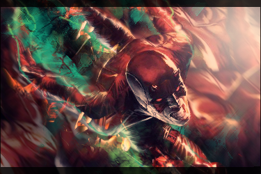
 STALKER - Spartan STALKER - Spartan
Ok, so i couldn't post this before because its for a battle, but the battle is now up, so i can post it for cnc. I made this like 10 days ago, and only got cnc from 2 people:

-

text isn't so good but as for the tag i like colors chosen would like to see render blended in more a tad bit and is grainy style u was going fore ? because thats what i see . maybe it's just my monitor ? but gj kiu
-

Meant to look old, and in actual fact, thats a stock (surprise surprise). And yeah, had to have name and team name on sig, so hard to find somewhere to put it
-

Did you blur the background at all? If not, might try it and see how it looks. If so, maybe a little more wouldn't hurt.

 = Monroe Smith IV = Monroe Smith IV
 = skeetonbeezies = skeetonbeezies
-

Maybe could do with some blur and smudging done and maybe a bit of lighting. Text looks ok I think 
I've used that stock before. Made it a while back. Here is mine http://i48.tinypic.com/xat0n8.png
-

the grainy bg isn't complete lol! there is a triangle behind his head, formed by wood, that you can look through. You forgot to rough it up there! I like the spartan text, but the double rainbow is to large. Maybe shorten it to DR. Other then this GJ.
From scratch, just smudging the XL way
-

Tried DR, didnt work so well, i will have a go at that triangle
-

Original Stock:
As far as I can see (even around the focal) you smudged nothing. Any smudge wise that I was going to give you credit for was already done.
I think you should try manipulation, don't be afraid to cut up your picture and put it back together again, it's the only way your going to learn anything. It's cool that your playing with colours and gradiants but push yourself even farther, this picture could have had some big updo if you are just willing to try more things (fractals/overlapping colourful stocks/c4d's) a good way to try new things is to put the new layer/c4d/ w/e over top of this than put a layer mask attached to it, use a black coloured brush and "erase" what you think doesn't look cool. and if you change your mind later just turn black brsh to white and it's a fixed image again. Thus you won't have to ruin anything to try out anything ^^
I hope I have given you some ideas and helped in some way because I do think you have an eye for art but I think you need to branch out more 
KIU
 Radi's one of a kind gift <3
 ^My Wish List^

-

MAte, at least show the full stock, not some cropped down version
And as far as iread, there is NO mention of smudging
Original stock:
http://images.google.com/imgres?imgu...1t:429,r:2,s:0
Last edited by silent_assasin; 09-11-2010 at 11:43 AM.
-

You didnt really do anything here but work on the color which was prolly done with a whole bunch of gradients and adjustments, as well as sharpening. . And then slapped on some text.
Imo theres nothing special but you do know how to work with colors and lighting. Step out of that boundary and work with effects.
I know you know there are some tutorials here to help you out step out of your comfort zone.
Otherwise kiu bro.

My Three Rules Of Making a Sig Flow, Lighting and Depth
Similar Threads
-
By Aces High in forum Digital Art
Replies: 2
Last Post: 09-30-2008, 07:57 AM
-
By Skatanic_ in forum Sigs & Manips
Replies: 7
Last Post: 08-21-2007, 10:52 AM
-
By RONIN in forum Sigs & Manips
Replies: 2
Last Post: 04-06-2007, 08:14 AM
-
By Rykiller in forum Digital Art
Replies: 5
Last Post: 11-25-2006, 01:15 AM
-
By ANtidote in forum Sigs & Manips
Replies: 11
Last Post: 09-01-2005, 06:35 PM
 Posting Permissions
- You may not post new threads
- You may not post replies
- You may not post attachments
- You may not edit your posts
-
Forum Rules
|


