0 members and 6,030 guests
No Members online

» Site Navigation

» Stats
Members: 35,443
Threads: 103,072
Posts: 826,684
Top Poster: cc.RadillacVIII (7,429)
|
-
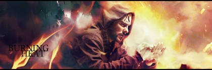
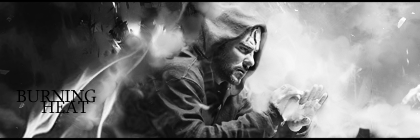
 Burning Heat Burning Heat
Hey guys, first tag I'm posting. I'm not a noob or anything to PS, just a noob to this forum.  Let me know what yall think about it. I made it B&W and colored. Which one do you prefer, or neither. Thanks! Let me know what yall think about it. I made it B&W and colored. Which one do you prefer, or neither. Thanks!
Colored:
B&W:
-
Hmm well the colors are off you have a navy blue on one side and a right yellowish orange. You usually want to be consistant with things on a sig like this and it throughs off the lighting. The text could go or be made better.
This has potential kiu and welcome to the void.

My Three Rules Of Making a Sig Flow, Lighting and Depth
-
Hmm well the colors are off you have a navy blue on one side and a right yellowish orange. You usually want to be consistant with things on a sig like this and it throughs off the lighting. The text could go or be made better.
This has potential kiu and welcome to the void.
My Three Rules Of Making a Sig Flow, Lighting and Depth
-
Ya see, I tried changing the blue to yellowish/orange-ish/redish, but it just looked like the tag was monocolored. It just didn't appeal to me, which I thought since the fire was fading from right to left, I would dull it out with a darker blue on the left to contrast it. Just my opinion, but thanks a lot for the crit! 
-
I dont mind the change of color, but the flames on the left side are way too prominant and out of place. Still good effects, but I prefer the B&W vers of this since the colors are uneven.
-
I like the colored more i think it looks good something feels off but i get molten rock from the blue like on a dead planet full of volcanos like thats molten rock i like it dude Check out my new Thread also please
Thanks RadillacVIII For the Sig It's Awesome
-
i think that blue-green thing on the upper left seems to be out of place
the text also has wrong text placement
-
yeah I think it's a pretty decent sig, the flame on the left( as said above) doesn't seem to fit, or needs to be fuzzed out some imo
 Radi's one of a kind gift <3
 ^My Wish List^

-
 Originally Posted by DR809

Hmm well the colors are off you have a navy blue on one side and a right yellowish orange. You usually want to be consistant with things on a sig like this and it throughs off the lighting. The text could go or be made better.
This has potential kiu and welcome to the void.
Wrong. The colors are awesome. They are complimentary colors, they work perfectly. The text isn't bad but it could be placed in a better location, some of the blending looks like it could be done better but it's still pretty good as a whole. I like the color version more by the way... A lot more. Good work.
-
Thanks for the Cnc yall. Appreciate it. And thanks RM, for the +. Glad you don't think it's too bad.
Similar Threads
-
By Agato in forum Sigs & Manips
Replies: 10
Last Post: 09-06-2010, 04:29 PM
-
By schultz in forum Sigs & Manips
Replies: 2
Last Post: 03-10-2010, 03:10 PM
-
By Dron in forum Sigs & Manips
Replies: 5
Last Post: 03-06-2010, 02:29 AM
-
By phatso in forum Digital Art
Replies: 3
Last Post: 11-05-2005, 12:43 AM
-
By .element in forum Digital Art
Replies: 4
Last Post: 09-06-2005, 07:14 PM
 Posting Permissions
- You may not post new threads
- You may not post replies
- You may not post attachments
- You may not edit your posts
-
Forum Rules
|


 Reply With Quote


