0 members and 1,906 guests
No Members online

» Site Navigation

» Stats

Members: 35,443
Threads: 103,072
Posts: 826,684
Top Poster: cc.RadillacVIII (7,429)
|
-
 ThatOne ThatOne
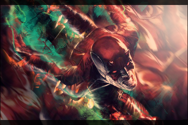
I made this tag following the same style as my Optimus Prime tag. (see Mad House thread.)

doesn't quite measure up, I think. Do your worst. 
-

I say remove the scanlines (could just be me) and work on lighting and add depth.
The light from the bottom is is weird because his pants and cape show shadows at the bottom (indicating the light source is from above)
And depth well is kinda hard to explain. So I'll direct you to two tut on how to use lighting and blurring to create depth.
http://www.sigtutorials.com/tutorial...ignatures.html
http://www.signaturestop.com/miscell...ture-tutorial/
-

as said above, and also try to work on flow. if you look at the tag you can see lines going in all kind off directions. try to a-void that 
From scratch, just smudging the XL way
-

Some tips:
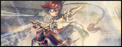
1. The border is too dark and thick because of how bright the sig is.
2. The border also makes it more obvious that there is no pure black in the sig. I would go to Levels and adjust the slider so that the darkest parts of your sig are straight black. This will help with the contrast.
3. Speaking of contrast, the white scanlines make this sig way too bright and throw off the flow if there was any to begin with. I remember when I first learned how to make scanlines I wanted to use them all the time too, but I would avoid using them in 99% of your sigs, especially covering the whole thing.
4. Because you have no shadows, you really have no lighting. You can fix this by burning certain areas but, as mentioned above, it would probably be easier (and maybe just as effective) to use Levels. You also should add a light source (300px round soft brush). I would put it above her head, but honestly it's kind of hard for me to discern where the light is coming from judging from the highlights on the render.
5. Depth. Think of depth as controlling what the viewer looks at. You want the viewer to look at the focal (in this case the girl). Currently, everything in this sig (the girl, the effects, the background) all demand equal attention because they are all on the same plane, meaning they're all equally in focus. So what you want to do is blur the background some and keep the girl in focus. But not the whole girl. For instance, her tail is behind her, so that would be blurred some too (but blurred less than the background, because it's closer than the background). Her hand isn't sitting directly below her chin, it's outstretched and therefore closer to the viewer. So you must decide if you want the focal to be her face or the hand. If you choose the face (I would), then you should blur the hand some too. Hope you have a clearer understanding of depth now.
6. Flow. I'm really not sure if this has flow or not. I want to say it doesn't. If it does, please point it out for me. Flow is similar to depth in that it allows you to control what the viewer looks at. On the left side you have lines that lead to the face (the focal), and that's good. That's a form of flow. But I would say you didn't put them there intentionally. Why? Because all the other effects you have don't compliment the flow at all. When creating flow, try to avoid having your lines intersect perpendicularly (like a + sign).
7. Colors. When it comes to the colors of your sig, it's really more of what you like than what's right. Nevertheless, it doesn't hurt to have some sort of color scheme. I would say your sig lacks a color scheme. The current colors seem very faded and washed-out as if it was a very vibrant and colorful sig that got left in the sunlight for too long and needs repair.

 = Monroe Smith IV = Monroe Smith IV
 = skeetonbeezies = skeetonbeezies
 Posting Permissions
- You may not post new threads
- You may not post replies
- You may not post attachments
- You may not edit your posts
-
Forum Rules
|


