0 members and 4,792 guests
No Members online

» Site Navigation

» Stats
Members: 35,443
Threads: 103,072
Posts: 826,684
Top Poster: cc.RadillacVIII (7,429)
|
-
-

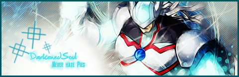
mm not mad man ^^
u need to blend that render in and u need a light point
the light effects on the render are a bit random i guess
Liking ur bg^^
kiu 
-
 Originally Posted by gaafjeah

mm not mad man ^^
u need to blend that render in and u need a light point
the light effects on the render are a bit random i guess
Liking ur bg^^
kiu
the render is usually orange because of the gradient. i just didnt like it. i like the original color.  ) thanks anyways. ) thanks anyways.
-
Yeah keeping it orange wil be making it a bit odd.
but if u look at the legs of the render u see there is some light on it, and u need a light point so that light wont distract me so mutch 
-
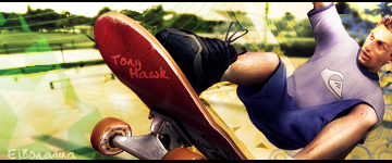
1. Add a lightsource between his face and arm.
2. Remove the text on his leg.
3. Remove the white splatter brushes.
4. Add some sparks or a similar effect to make it look like he's grinding, or make the skateboard on fire. Something that makes sense. The white splatter just looks like bird shit to be honest.
5. Blur the background a little bit. I would make your focal be the skateboard, since you have the text there anyways.
6. Colors seem random, but not entirely unbelievable. What's wrong with the colors? Well you have a background that looks like the sun is setting, and it full of worm colors. Then you have Tony Hawk that looks like he's in broad daylight, full of cool colors, and doesn't have a single hint of the sunlight anywhere on him. One way to fix this would be to grab an orange brush and brush along the edges of the render. Another way would be to add a black & white gradient just to the render itself and then add a warm photo filter.

 = Monroe Smith IV = Monroe Smith IV
 = skeetonbeezies = skeetonbeezies
-
updating it right now. btw, i dont really know how to add a spark effect. im not that good with photoshop yet
-
I would experiment with brushes and stocks of sparks.
= Monroe Smith IV
= skeetonbeezies
-
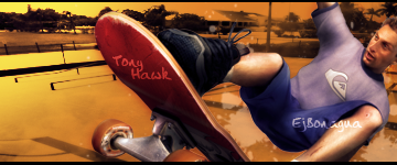
i updated it. but its still unfinished. im adding more colors. blurred the bg. added some lighting. tried to put sparks(i didnt really did it right). i will post it tommorow.
(sorry for my english, my grammar sucks)
-
Here is the new one. Its not that good. But its ok for me
-
I like it, but I think it still needs that light source Monroe mentioned, and avoid corner text.
It does look a lot better with all the different brushes, kiu.
Similar Threads
-
By Alexander in forum Sigs & Manips
Replies: 9
Last Post: 03-10-2007, 05:14 PM
-
By ilovecoheed in forum Digital Art
Replies: 3
Last Post: 02-08-2006, 08:27 AM
-
By food in forum The Void
Replies: 9
Last Post: 09-12-2005, 04:30 PM
-
By navy in forum Digital Art
Replies: 7
Last Post: 07-28-2005, 12:19 PM
-
By PP Bone in forum Sigs & Manips
Replies: 5
Last Post: 06-15-2005, 11:34 PM
 Posting Permissions
- You may not post new threads
- You may not post replies
- You may not post attachments
- You may not edit your posts
-
Forum Rules
|


 Reply With Quote