0 members and 3,221 guests
No Members online

» Site Navigation

» Stats
Members: 35,443
Threads: 103,072
Posts: 826,684
Top Poster: cc.RadillacVIII (7,429)
|
-
 Latest sigs Latest sigs
-
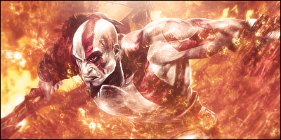
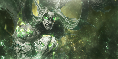
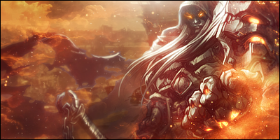
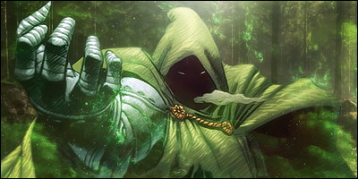
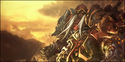
Bravo  they are beautiful no liein about that ^^ they are beautiful no liein about that ^^
I would suggest only one thing. They are so close together in colour maybe you shouldn't show them all together like this because than they look like all the same thing  If you get me If you get me
I like 1,4,2 in that order I would love to see you make a tut out of 2 bro ^^
KIU <3
 Radi's one of a kind gift <3
 ^My Wish List^

-
All look the same, and not very clean, but gj, kiu
-
you shuld try an difrend style thet are all a bit the same imo.
but gj on those man
-
They all look pretty sick to me. A little repetitive as well.

 = Monroe Smith IV = Monroe Smith IV
 = skeetonbeezies = skeetonbeezies
-
As gaafjeah said, I think they all look a little too similar. It's not bad to keep the same style, but change it up a bit in that style. Even though I do it sometimes, I'm not a fan of the "film" above the tag. The whole tag looks bright, and I think it diminishes the tag. Use the dodge and burn tool places, and these will look killer. Good job bud.
-
Nice sigs but they mostly seem dull and lacking in contrast and change up the style everyone in a while :P

My Three Rules Of Making a Sig Flow, Lighting and Depth
-
First is worst and second is the best.
-
-
Great style!
Great renders =)
Similar Threads
-
By WarZone in forum Sigs & Manips
Replies: 2
Last Post: 11-07-2008, 04:50 PM
-
By oneshot in forum Sigs & Manips
Replies: 4
Last Post: 06-04-2006, 12:48 PM
-
By Mike_956 in forum Sigs & Manips
Replies: 1
Last Post: 05-14-2006, 04:32 PM
-
By RAHTING in forum Sigs & Manips
Replies: 6
Last Post: 08-22-2005, 05:40 AM
-
By Outlaw in forum Sigs & Manips
Replies: 7
Last Post: 07-12-2005, 06:09 PM
 Posting Permissions
- You may not post new threads
- You may not post replies
- You may not post attachments
- You may not edit your posts
-
Forum Rules
|


 Reply With Quote


