0 members and 5,712 guests
No Members online

» Site Navigation

» Stats
Members: 35,443
Threads: 103,072
Posts: 826,684
Top Poster: cc.RadillacVIII (7,429)
|
-
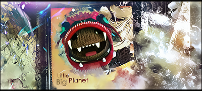
 Sack Boy Sack Boy
So I told someone I was gonna try a tag of Little Big Planet, so I went for it. lol. What do yall think?
-
Too much going on. It's overblended, and the focal point gets lost within the sig.
-
Not gettin mad or anything, but how is the focal lost? First thing I see in the tag is a huge brown splotch right in the middle of the tag, lol. Just curious, but thanks for the crit anyways.  would love to hear more. would love to hear more.
-
It's a bit of a floating head...
-
Honestly there's nothing wrong with a "floating head". Sometimes it works, sometimes it doesn't. It's like the saying goes (off the top of my head): Learn the rules, that way you know how to properly break them. So in other words, yeah, most of the time you want to avoid a floating head, but sometimes it works perfectly. If you disagree, look at that Restrained Queen tutorial. Exactly.
As for the focal being lost or whatever. I agree with you Doodle, the first thing you see IS the focal, but it's so uninteresting and blended so well into the background that it doesn't demand the attention that a focal should. So sure, it's the first thing you look at, but then your eyes wonder looking for something else more appealing, and they're disappointed.
I'm not one for conformity, and I like to break the rules. But that being said, this piece still lacks the basic elements like depth and lighting just to name a couple that makes good sigs good.

 = Monroe Smith IV = Monroe Smith IV
 = skeetonbeezies = skeetonbeezies
-
Alright, thanks for the crit guys, I know what yall mean now.
-
Nice job, I like your sigs, kiu
-
I luv it ^^ its got colour but not too lost with the effects... I liek the bg becuase it's hard to tell what it is .. it's almost an abstract piece <3
KIU Doodlekin 
 Radi's one of a kind gift <3
 ^My Wish List^

-
lmfao@Doodlekin got your self a new pet name hank as i told u before on msn about this tag i feel same as i did then as i do now even after what these people say about it. your new style is working for you bro it's your focal jumping out at u from a picture frame i could see that a mile away , the colors go very well with your render and your bg as well kiu bud only thing i suggested needed to be changed was the fat boarders ont he sides of it .
Similar Threads
-
By zole in forum Sigs & Manips
Replies: 3
Last Post: 06-24-2010, 04:56 PM
-
By Conflict39 in forum Digital Art
Replies: 2
Last Post: 01-30-2007, 06:54 AM
 Posting Permissions
- You may not post new threads
- You may not post replies
- You may not post attachments
- You may not edit your posts
-
Forum Rules
|


 Reply With Quote


