But we're the ones who kill our neighbors, To stay safe and sound Rad is King!
Great job. It's as attractive as it is unique.
= Monroe Smith IV = skeetonbeezies
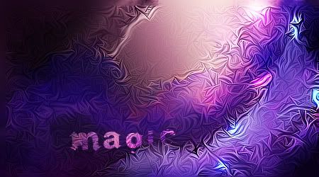
I'm not fond of the way the text is blended in and the transition to black in the top-left corner. I do like the way the texture is lighted and sharpened/blurred to bring focus. I recognize the pattern elsewhere (tree trunk): http://www.wpgallery.com/gallery/dis...501&fullsize=1 =D I'm curious, how'd you make it?
DeviantArt
overtopazed, to clean for my liking. nice concept tho!!
From scratch, just smudging the XL wayGIFTS: GiftmapACHIEVEMENTS: Scribble's Artist of the Week #2 - SpiderAttackSOTW#204 - Architecture SOTW#340 - Journey
not a fan at all of this seems too simple and looks like u just messing with topaz ;p; sry man ive seen better from you kiu
Congrats, you can use Topaz.
My Website
Forum Rules


 Reply With Quote


