0 members and 2,325 guests
No Members online

» Site Navigation

» Stats
Members: 35,443
Threads: 103,072
Posts: 826,684
Top Poster: cc.RadillacVIII (7,429)
|
-
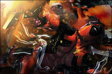
 Deadpool Sig Deadpool Sig
Last edited by Monroe; 09-30-2010 at 05:00 PM.

 = Monroe Smith IV = Monroe Smith IV
 = skeetonbeezies = skeetonbeezies
-
nice idea but it dosnt look like u did much <_< only add bg and lightning o_O
Favorite and Most Recent  :

-
I thought good artwork was judged on how appealing it is to the eye, not how complex or time-consuming it was to make it. Thanks for the criticism.
= Monroe Smith IV
= skeetonbeezies
-
the render looks just splatted on, you might try blending it some. further the tag suggests motion, so add some motion effects. it will add to the depth as well. 
i allready like it, but it can be better i think.
From scratch, just smudging the XL way
-
Monroe is right, but I think there are still some flaws with this. There's an outline around the render that has to go. There really should be some blending in the bottom, in my opinion. The lighting needs work. Use the dodge/burn tool on the render for some better lighting as well as depth. The render should probably be sharpened a little too. And last, what is the black thing right above his head? Looks like a motion blur of some sort.
I've seen way better from you, Monroe!
-
v2
= Monroe Smith IV
= skeetonbeezies
-
Hm lighting is nice. Effects are good. Good job its better than v1.
However I have to say there are some points that seem over sharpened a bit.
Other wise kiu bro.

My Three Rules Of Making a Sig Flow, Lighting and Depth
-
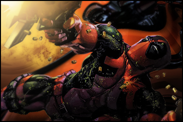
v1 imo
the lighting is slightly off on the face, but i like the compo
In all deepest reality, we may only imagine the days past us, knowing that anything and all happens; and time will never be written until the happening... The future is 'eXcellence'.
eXx
-
Yeah, the lighting is off, but the tag itself is pretty well done. I like v1 more because it doesn't seem like a big mess to make it look more interesting.
XBox Live: DailyVitaminC Post Milestones: [ 50 | 100 | 200 | 500 | 1000 ]
-
v2 ftw !!! good stuuf imo man
Similar Threads
-
By sMom in forum Sigs & Manips
Replies: 2
Last Post: 06-28-2010, 09:42 AM
-
By Eminentz in forum Sigs & Manips
Replies: 7
Last Post: 03-26-2010, 01:42 PM
-
By MrInsane in forum Sigs & Manips
Replies: 14
Last Post: 01-27-2010, 12:46 AM
-
By -MM.Kritez in forum Sigs & Manips
Replies: 6
Last Post: 01-08-2010, 12:09 AM
-
By Ðìgï±å£ in forum Sigs & Manips
Replies: 2
Last Post: 02-01-2008, 03:30 AM
 Posting Permissions
- You may not post new threads
- You may not post replies
- You may not post attachments
- You may not edit your posts
-
Forum Rules
|


 Reply With Quote


