GFXVoid Graphic Design Forum

Remove Text Formatting
Loading...

» Online Users: 8,340

0 members and 8,340 guests
No Members online

» Site Navigation

 > FAQ

» Stats

Members: 35,443
Threads: 103,072
Posts: 826,684
Top Poster: cc.RadillacVIII (7,429)
Welcome to our newest member, Lekelindids
Results 1 to 7 of 7

Thread: Wolverine

  1. #1
    Join Date
    Sep 2010
    Location
    Philippines
    Posts
    873

    Default Wolverine


    V2


    Used slave's render. CnC
    Last edited by ejbonagua; 10-11-2010 at 02:15 AM.

    FOLLOW ME ON DEVIANT ART!
    http://ejbonagua.deviantart.com/

  2. #2
    Join Date
    Oct 2010
    Posts
    148

    Default

    Try using different c4ds.
    The c4ds have no flow what so ever. I know what you were trying to do with this signature.
    Over all nice signature. 8.5/10

  3. #3
    Join Date
    May 2008
    Location
    Michigan
    Posts
    1,227

    Default

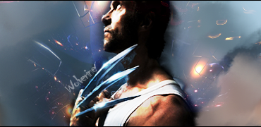
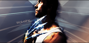
    Yeah. Your c4d choice is kinda lame. The tag overall is pretty boring and flat. No light source, depth, or anything interesting really going on. The text is horrible too. Stick to fonts that are more traditional.

  4. #4
    Join Date
    Aug 2010
    Location
    Canada
    Posts
    3,286

    Default

    well i like the smudging going on and i think you did a good job making those blades look realistic, as said above the c4d work needs a little work :P gj tho getting some c4d texture in there, try some sharp pointed c4ds or some jagged looks instead of buble fairy lights

    kiu an ty for use hope it was easy to work with )

    Radi's one of a kind gift <3

    ^My Wish List^


  5. #5
    Join Date
    Sep 2010
    Location
    Philippines
    Posts
    873

    Default

    ill try to make v2. post it later

    FOLLOW ME ON DEVIANT ART!
    http://ejbonagua.deviantart.com/

  6. #6
    Join Date
    Sep 2010
    Location
    Philippines
    Posts
    873

    Default

    made v2. cnc

    FOLLOW ME ON DEVIANT ART!
    http://ejbonagua.deviantart.com/

  7. #7
    Join Date
    Jul 2009
    Location
    Brooklyn, New York
    Posts
    1,604

    Default

    Very plain nothing really going on, on either sig
    You seem to have messed up the overall quality of the focal and im not really liking the text on either sig.
    The smudging on the render doesnt seem to being doing it justice either.
    Keep working at it bro.

    My Three Rules Of Making a Sig Flow, Lighting and Depth


Similar Threads

  1. Wolverine tag
    By sirenzo in forum Sigs & Manips
    Replies: 15
    Last Post: 09-20-2010, 09:48 PM
  2. I am wolverine
    By supremegraphx in forum Digital Art
    Replies: 8
    Last Post: 01-10-2010, 04:07 AM
  3. Wolverine Sig!
    By Newton in forum Sigs & Manips
    Replies: 3
    Last Post: 08-29-2009, 04:01 PM
  4. Wolverine Tag
    By Takken in forum Sigs & Manips
    Replies: 1
    Last Post: 06-03-2009, 09:16 PM
  5. Wolverine!
    By Arcmenis in forum Sigs & Manips
    Replies: 3
    Last Post: 05-18-2009, 03:28 PM

Posting Permissions

  • You may not post new threads
  • You may not post replies
  • You may not post attachments
  • You may not edit your posts
  •  
Powered by vBadvanced CMPS v4.1.1