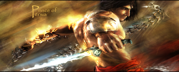
GFXVoid Graphic Design Forum

Remove Text Formatting
Loading...

» Online Users: 586

0 members and 586 guests
No Members online

» Site Navigation

 > FAQ

» Stats

Members: 35,443
Threads: 103,072
Posts: 826,684
Top Poster: cc.RadillacVIII (7,429)
Welcome to our newest member, Lekelindids
Results 1 to 2 of 2
  1. #1
    Join Date
    Sep 2010
    Location
    Philippines
    Posts
    873

    Default Prince of Persia(Again, LOL)


    More smudged v2


    CnC please

    FOLLOW ME ON DEVIANT ART!
    http://ejbonagua.deviantart.com/

  2. #2
    Join Date
    May 2009
    Location
    Que?
    Posts
    2,460

    Default

    You have some flow going on and the smudge is fairly consistent, however it lacks color, it looks too dull and it needs mroe detail in the smudge. The lighting isn't all that good and there is not much of an effective contrast going on. I'm not realy liking the text; the siuze is too small, font doesn't go and the placement is otherwise.

    Like the effort though, keep at it!

    Quote Originally Posted by Slave
    takken, you sweet boy you, i could eat you 6^

Similar Threads

  1. Prince Of Persia
    By Downfall in forum Sigs & Manips
    Replies: 4
    Last Post: 10-23-2010, 10:06 PM
  2. Prince of persia
    By Lew in forum Sigs & Manips
    Replies: 10
    Last Post: 10-10-2008, 11:17 AM
  3. Prince of Persia C&C
    By zole in forum Sigs & Manips
    Replies: 6
    Last Post: 08-07-2008, 09:07 AM
  4. prince of persia
    By BeaSt in forum Digital Art
    Replies: 4
    Last Post: 07-16-2007, 08:18 PM
  5. Prince Of Persia
    By projekt. in forum Digital Art
    Replies: 2
    Last Post: 04-27-2007, 11:44 AM

Posting Permissions

  • You may not post new threads
  • You may not post replies
  • You may not post attachments
  • You may not edit your posts
  •  
Powered by vBadvanced CMPS v4.1.1