GFXVoid Graphic Design Forum

Remove Text Formatting
Loading...

» Online Users: 6,051

0 members and 6,051 guests
No Members online

» Site Navigation

 > FAQ

» Stats

Members: 35,443
Threads: 103,072
Posts: 826,684
Top Poster: cc.RadillacVIII (7,429)
Welcome to our newest member, Lekelindids
Results 1 to 3 of 3
  1. #1
    Join Date
    Aug 2010
    Location
    Im Problly In The Sky Swimming With The Fishes
    Posts
    155

    Default New Sig! (Bleach)

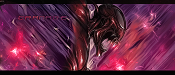
    This is my latest sig i left out the txt since i always have a bad choice in text.

    C&C Plz!


  2. #2
    Join Date
    Oct 2010
    Posts
    29

    Default

    I like it, maybe it could do with abit more blur to add depth, also i think it may look better if the edges where darkened and the sig had a curve layer added. But its still a good job.
    Latest


  3. #3
    Join Date
    Aug 2010
    Location
    Im Problly In The Sky Swimming With The Fishes
    Posts
    155

    Default

    thanks for the advice!


Similar Threads

  1. Another bleach tag
    By Krunch_ in forum Sigs & Manips
    Replies: 3
    Last Post: 06-26-2010, 07:09 AM
  2. Bleach
    By cC.Midway in forum Sigs & Manips
    Replies: 7
    Last Post: 05-13-2009, 10:30 AM
  3. Some bleach guy :D
    By spooner in forum Sigs & Manips
    Replies: 5
    Last Post: 02-08-2009, 07:32 AM
  4. Bleach
    By imported_Sharingan in forum Digital Art
    Replies: 3
    Last Post: 07-31-2006, 08:45 AM
  5. bleach - not quite done yet
    By imported_worldikon in forum Digital Art
    Replies: 3
    Last Post: 04-15-2006, 06:00 AM

Posting Permissions

  • You may not post new threads
  • You may not post replies
  • You may not post attachments
  • You may not edit your posts
  •  
Powered by vBadvanced CMPS v4.1.1