0 members and 1,876 guests
No Members online

» Site Navigation

» Stats
Members: 35,443
Threads: 103,072
Posts: 826,684
Top Poster: cc.RadillacVIII (7,429)
|
-
-

Whoa, are those John Hancock sigs up there?!
Joke aside, I think those top 2 can hardly be considered 'sigs'.
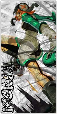
Num.one
Pretty nice, but as I've mentioned, that is too big in height to be considered a sig. I would consider getting the gray swirls off of the foreground, and maybe play with it in the background. The text is horrid; I don't know, it just doesn't 'belong' in that style or that area (if you want to designate it better, I'd consider making a strip of layer behind it, and then erase-brush up on it to where it fades at the inside end - or messing with the Blending options to get the best effect). Right now, it's just too bland for my liking. Great character though, and nice cropping. But I'm not feeling the sig as a whole.
7.5/10
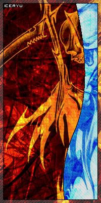
Num.two
First off, get rid of that blue mess on the side of your sig. It's too contrasting towards the bg, and I doubt that you would want that 'blue' strip to be the focal point as it did to me. If you still insist on keeping it up there, I would at least feather that blue layer into the background, or take the 1px stroke off of it as it's pretty jagged around the curves. Your best bet for a better version of this sig would be to take the blue strip off altogether.
6.5/10
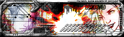
Num.three
[i]Ahh! It's the return of the cliche 'Tech Border' siggy! That's what I call it anyway, and I agree. To be honest, it does suck. Just look at the face on the left - how sad he must be to be featured in such folly. I wouldn't think Brittany was very happy about her pictures being featured in it either... j/k :P I can't really say, it's not terribly bad, but it's not terribly good. It's just there - with a very strange background of a chick smiling and a dude looking depressed (Sorry if the 'dude' is a female, lol, I couldn't tell otherwise) all with some big vibrant flare in the middle. Why go with such a complex composition? Eh.. on the other hand, it has some decent animation.
5/10
Num.four
Pretty much the same as the above, but the text is more of an issue here. It's all jagged, and is a real nuisance to read. Try selecting the "Smooth" option at the top when selecting a font. It should deal well with the jagginess. Some elements of the sig seemed as though it was just slapped there without any real thought. It's an ok sig, nothing extra-spectacular, not that you've mentioned about going to such extent.
7.5/10
Num.five
Get a new font, one that is easier to make out (preferably, solid). Bright Kool-Aid-red colored font doesn't correlate well with the 'grim' background.
7.5/10
Num.six
Mystery and color don't go hand in hand. At least, that's what I would think your avatar's trying to portray there. The text, is whack. Consider the above suggestion.
6/10
Num.seven
I like it. That is, everything except the font. The font seems a bit blurred up compared to the sharper background (sharp near the bottom, imo). If the font was on par with the background (which I like - it's different for a change! , I'd say it'd make a whole heckuva difference. Try losing some transparency on the text. It might do you some good. , I'd say it'd make a whole heckuva difference. Try losing some transparency on the text. It might do you some good.
8.5/10
Num.eight
Some relief for my eyes! That's a unique avatar. I think the colors you've chosen are great. Aghast! The text is 'readable' for once! :lol: No more decoding, hehe :P. Hope that's a long-term scenario, as the others are a bit... bleh/blah.
The techie stuff actually works out here, unlike your two tech-riddled siggy's. It might be a bit too much, but it's all good.
9/10
Hope you found this some-what helpful.
Cheers,
-psy
-
Thanks for the critique...it must've took lots of your time :P thanks again xD
and yeah i add too much to my sigs
DONT talk if you have NOTHING good to say.
Similar Threads
-
By bluesepsis in forum Sigs & Manips
Replies: 3
Last Post: 05-29-2006, 12:18 PM
-
By undertone in forum Sigs & Manips
Replies: 6
Last Post: 09-06-2005, 06:55 PM
-
By DragonsRage in forum Sigs & Manips
Replies: 3
Last Post: 05-18-2005, 02:34 AM
-
By just_a_flip in forum Sigs & Manips
Replies: 13
Last Post: 04-17-2005, 12:43 AM
-
By shajn in forum Sigs & Manips
Replies: 4
Last Post: 03-29-2005, 12:53 PM
 Posting Permissions
- You may not post new threads
- You may not post replies
- You may not post attachments
- You may not edit your posts
-
Forum Rules
|


i have too much free time xD :P


 Reply With Quote

