GFXVoid Graphic Design Forum

Remove Text Formatting
Loading...

» Online Users: 2,014

0 members and 2,014 guests
No Members online

» Site Navigation

 > FAQ

» Stats

Members: 35,443
Threads: 103,072
Posts: 826,684
Top Poster: cc.RadillacVIII (7,429)
Welcome to our newest member, Lekelindids
Results 1 to 8 of 8
  1. #1
    Join Date
    Nov 2010
    Location
    Michigan
    Posts
    269

  2. #2
    Join Date
    Oct 2010
    Location
    The Netherlands
    Posts
    113

    Default

    i like it.
    except that part at his back those 2 bars.
    delete those and its perfect.
    just perfect. ^^

  3. #3
    Join Date
    Dec 2006
    Posts
    5,223

    Default

    it's interresting concept i think it's your style of tag but im not big fan of the ghost layer of you render . but desent tag m8 kiu nice use of colors and blending of your focal could use a bit more work light source looks alright .


  4. #4
    Join Date
    Sep 2010
    Posts
    413

    Default

    i like brother stile nice . good text effects good work.

  5. #5
    Join Date
    Mar 2009
    Location
    Latvia
    Posts
    2,381

    Default

    Lovely tag, but text is bit too much :S light isnt bad aswell, maybe add it bit more depth other ways, love ur style!


  6. #6
    Join Date
    Nov 2010
    Location
    Michigan
    Posts
    269

    Default

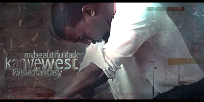
    Thanks guys. My Beautiful Dark Twisted Fantasy is Kanyes new album thats comin out pretty soon. Made this sig while watchin the Runaway movie on facebook.. I think Im gettin my PS mojo back lol

  7. #7
    Join Date
    May 2010
    Posts
    1,942

    Default

    I really like the text and urban feel to it.

    Remove the two boxes on the right and try to add more effects, looks slightly dull atm.
    Good work ^u^ !


    My gift wall!
    My gift wall #2!
    My Genesis Tag Tutorial, check it out here!
    My Halo Tag Tutorial, check it out here!


  8. #8
    Join Date
    Mar 2010
    Location
    Where I'm needed.
    Posts
    94

    Default

    lol I wish his actual album cover looked as good as you sig.

    Like everyone else said the boxes are distracting but other then that good work


Posting Permissions

  • You may not post new threads
  • You may not post replies
  • You may not post attachments
  • You may not edit your posts
  •  
Powered by vBadvanced CMPS v4.1.1