0 members and 4,332 guests
No Members online

» Site Navigation

» Stats
Members: 35,443
Threads: 103,072
Posts: 826,684
Top Poster: cc.RadillacVIII (7,429)
|
-
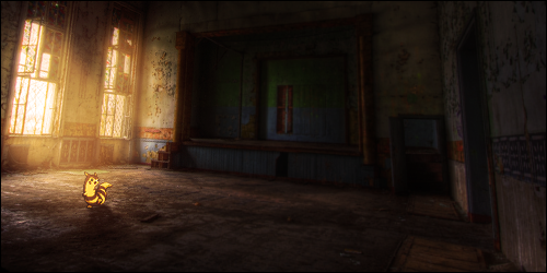
 Prototype sig. CNC Please. Prototype sig. CNC Please.

I focused on lighting, flow, and depth on this one. I realize it's a tad empty on the far side. :/
-
It's a bit empty and the colors are dull.
Add some contrast + a bit more saturation and some effects that would give it a 'wow' factor.
Good work, flow and depth are pretty good mate.
-
I actually knocked down the saturation a bad, I personally thought it looked better.
-
The top left is kind of empty and as the other guy said, it needs more colour to brighten it up a bit. Do that and your sig would look great.
-
i actually think the colors are nice. but that's all
-
Im kidding of digging it as is
Good job
KIU
-
i like the depth and lighting and flow
but the smudge is boring and it is a bit dull
but i like it
-
the texture is nice, Tho I do feel the same about colour, I would have liked it more I think if it had more vibrant colouring in it...
KIU Run ^^
 Radi's one of a kind gift <3
 ^My Wish List^

-
The lighting, depth and flow are really good, since that's what you were focusing on, awesome job :]
The BG does seem plain, but that's okay, just apply your skills to more stuff you make now. ^^
Keep up the good work
-
that would make a really good poster.
Similar Threads
-
By Wolf' in forum Sigs & Manips
Replies: 4
Last Post: 10-26-2010, 04:50 AM
-
By starwar in forum Sigs & Manips
Replies: 4
Last Post: 01-18-2010, 09:55 AM
-
By cs4pro in forum Sigs & Manips
Replies: 5
Last Post: 11-17-2009, 03:52 AM
-
By cs4pro in forum Sigs & Manips
Replies: 8
Last Post: 09-25-2009, 10:19 PM
-
By cc.mio in forum Sigs & Manips
Replies: 2
Last Post: 09-07-2009, 02:27 AM
 Posting Permissions
- You may not post new threads
- You may not post replies
- You may not post attachments
- You may not edit your posts
-
Forum Rules
|


 Reply With Quote


 Thanks JDragon <3


