0 members and 7,288 guests
No Members online

» Site Navigation

» Stats
Members: 35,443
Threads: 103,072
Posts: 826,684
Top Poster: cc.RadillacVIII (7,429)
|
-
 Time4champion Time4champion
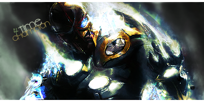
CnC appreciated :].
v2
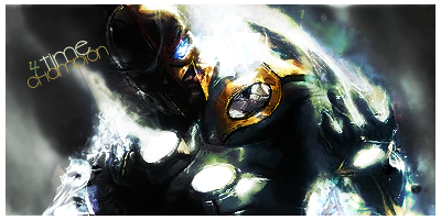
Last edited by Timentia; 12-24-2010 at 04:31 PM.
-
-
Its a robot man thing?
A signature?
-
I really enjoy this dude, the colours look epic.
The right side of the dude is way better than the left!
But, it looks a bit too sharp :S
The bg could use a bit more its quite simple!
With work this could be awesome, keep it up!
-
 Originally Posted by Mountford

I really enjoy this dude, the colours look epic.
The right side of the dude is way better than the left!
But, it looks a bit too sharp :S
The bg could use a bit more its quite simple!
With work this could be awesome, keep it up!
yeah ive been at this for like 20 minutes :P
might continue after xmas, spotted some faults in it :]
and i actually thought of not adding any effects on the right side to make it seem like he got shut down, but then itd be a boring sig lol
-
a bit overexposed but the rest is a nice signature.
KIU!
-
Originally Posted by SunPower
a bit overexposed but the rest is a nice signature.
KIU!
whats kiu 
And thanks :]
-
Originally Posted by Timentia
whats kiu
And thanks :]
Keep It Up. 
But yeah, I think it's a little oversharpened. I like how he stands out, just take down the sharpen on the effects. Not bad man, keep working.
-
edit: added a v2
made the effects have a bit more light, i made the left side of him a bit black and white to make it look more like hes shutting down, lowered the sharpen a bit :]
 Posting Permissions
- You may not post new threads
- You may not post replies
- You may not post attachments
- You may not edit your posts
-
Forum Rules
|


 Reply With Quote


