0 members and 1,862 guests
No Members online

» Site Navigation

» Stats
Members: 35,443
Threads: 103,072
Posts: 826,684
Top Poster: cc.RadillacVIII (7,429)
|
-
 IRON MAN yet again.. IRON MAN yet again..
I have an issue, I SUCK with the following tools:
- Sharpen
- Dodge
- Burn
Please Cnc, its for the greater good 
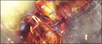
My lame effort using the tools! Cnc again pweaasee! :]
Last edited by Mountford; 12-29-2010 at 04:04 PM.
-
lol
i believe those + smudge are my best tools 
uhm i dont like the placement of the text, light source looks like some kinda yellow hole that iron man gets sucked in, you should burn everything but iron man and sharpen iron mans front arm, and blur iron mans other arm
:]
-
Its actually supposed to be IronMans blast out of his feet, but oh well! Okay il give it a shot!
Its hard for me to use the tools because my PS is so laggy!
Thanks for cnc bro x
-
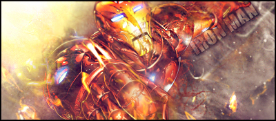
It's a good start man but tbh I never use burn or dodge tools lol it looks like you have effects over his face might want to erase that to make him more of the focal
Also I like the text just fade it alittle bit so it doesn't stand out as much. Keep workin with it man it's a good start just need tweaks
-
sharpen:
apply image - then sharpen - erase everything except for the focal - if it is to sharp then put the layer on darken!!
dodge:
apply image - set the dodge tool to highlights and use a small round brush - now look for parts in your tag that you want to stand out; like firy things and brighten them up.
burn:
apply image - set the burn tool to shadows - use a large soft brush - now look at your light and the direction it is - burn the sides or the parts of your tag that need to have a darker bg.
hope this helped 
XL
From scratch, just smudging the XL way
-
Xelo.. that is exactly what I wanted to know, cheers dude!!
Thanks for the cnc everyone, il give it a try!
-
 Originally Posted by UnDeRoAtH

It's a good start man but tbh I never use burn or dodge tools lol it looks like you have effects over his face might want to erase that to make him more of the focal
Also I like the text just fade it alittle bit so it doesn't stand out as much. Keep workin with it man it's a good start just need tweaks
I just spent an age looking for the effects on his face.. turns out its part of the render! D:
-
this is a difficult render.. you did a good job. i just don't like the text, but that's probably me.
From scratch, just smudging the XL way
-
Cheers man
Is it the Text in general? or the placement?
how can i improve it? (I quite like this sig so i wana make it even better!)
-
Sharpen the focal a bit. New layer> Apply image > Filter > Sharpen
Erase parts.
Similar Threads
-
By cc.mio in forum Sigs & Manips
Replies: 6
Last Post: 12-26-2010, 12:54 PM
-
By chonfat in forum Sigs & Manips
Replies: 13
Last Post: 03-05-2010, 09:18 AM
-
By cs4pro in forum Sigs & Manips
Replies: 5
Last Post: 02-24-2010, 08:57 AM
-
By THAIsack in forum Sigs & Manips
Replies: 1
Last Post: 02-20-2010, 08:48 PM
-
By Eddie da man in forum Sigs & Manips
Replies: 12
Last Post: 01-21-2010, 12:39 AM
 Posting Permissions
- You may not post new threads
- You may not post replies
- You may not post attachments
- You may not edit your posts
-
Forum Rules
|


 Reply With Quote