0 members and 378 guests
No Members online

» Site Navigation

» Stats
Members: 35,443
Threads: 103,072
Posts: 826,684
Top Poster: cc.RadillacVIII (7,429)
|
-
 The Girl with the Dragon Tattoo The Girl with the Dragon Tattoo
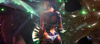
Spent a good hour on this sig using c4d blend and filter effects. c&c much appreciated.

Genisphere - TRUeLM - VaN ZeBeN 1st Place Team Battle Collab

Gifts
-
woah..no flow..uhh render dnt match bg txt is horrible...needs a lot of work...kiu
fixes: try to use better c4d for better efx...is there a c4d on the render if so i recoment not doing tht unless it gives a nice effext..for text sometimes its better to go simple..and placement theres a tut out tht tht i learned from on text placement pm me if u want it...needs a more defined lightsource...
ps: didnt mean to sound like a meanie was rushing a bit cuz we had to go somewhere
Last edited by Vash808; 12-30-2010 at 03:09 AM.
Reason: had to finish
-
 Originally Posted by Vash808

woah..no flow..uhh render dnt match bg txt is horrible...needs a lot of work...kiu
c'mon bro that's a tad bit too blunt, don't you think? critiques should be helpful, not discouraging, right?
ok i think its a good try and with some improvements, it can be better. i see you've used quite a few c4d's but they sorta seem all over the place and like vash did mention they lack flow. usually one or two c4d's is enough to enhance your tag but dont let it overwhelm the render. like that white and blue c4d all over the girl, its distracting and should have been erased or somehow blended in.
i think for this, a vertical tag would have been better, since you want the attention on the girl and when you have it horizontal, you can see your render has to be minimized. vert would have brought your focal more and you would have had to worry less about covering up negative space with c4d's.
i actually like lighting on this, its not bad especially on the left.
as for text, my rule is to keep it simply. don't try to do crazy fonts or effects (like the wave). mostly i like to stick with arial or TNR, clipmask them and it seems to do the trick.
kiu
Last edited by notthefed; 12-30-2010 at 02:19 AM.
-
-
I think changing the text would make a big difference
-
Thanks for the comments guys
never done a vertical signature but i thought i would redo this and see how it turned out here's what i came up with

Genisphere - TRUeLM - VaN ZeBeN 1st Place Team Battle Collab
Gifts
-
-
Ver 2. slightly changed a few things
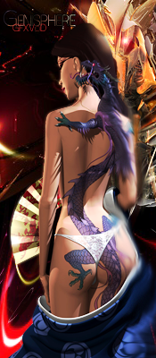
Genisphere - TRUeLM - VaN ZeBeN 1st Place Team Battle Collab
Gifts
-
V2 is much more improved from v1.
just adding more depth would be better for this tag
Similar Threads
-
By cC.ShorterGFX in forum Sigs & Manips
Replies: 4
Last Post: 02-06-2010, 10:49 PM
-
By Walsh in forum Sigs & Manips
Replies: 2
Last Post: 07-09-2008, 09:15 AM
-
By Virulent in forum The Void
Replies: 31
Last Post: 01-11-2007, 04:25 PM
-
By Death of a Clown in forum Digital Art
Replies: 5
Last Post: 06-20-2005, 01:19 AM
-
By ZeKayeM in forum Digital Art
Replies: 9
Last Post: 03-18-2005, 08:33 PM
 Posting Permissions
- You may not post new threads
- You may not post replies
- You may not post attachments
- You may not edit your posts
-
Forum Rules
|


 Reply With Quote


 KIU!
KIU!


